After a stint of some headline serif (and false-serif) fonts, I went to the opposite direction to neutral sans serif, and drew a font to resemble Helvetica. I made an effort not to look at any samples of Helvetica during this (pretty much impossible to do these days, I found out).
Here is the result of my week:
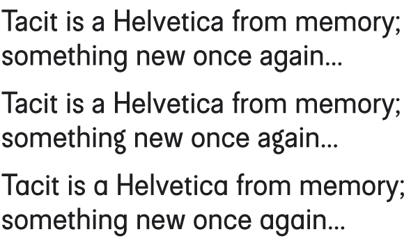
I was surprised how ingrained the basic Helvetica(ish) shapes were in my head. And I was also surprised how wide the basic Helvetica is; my design is almost condenced (well; I'm a Finn, so narrow typefaces come naturally to me). None of the glyphs are an exact match to Helvetica, but the overall look comes pretty damned close. Some glyphs I decided to make clearly different. Some of the glyphs were a bugger to draw; this sort of neutral design allows very little bumping…
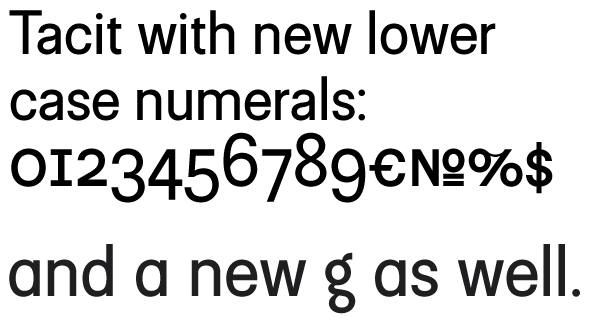
I also made an alternate two-storey g and a single-storey a.
Some glyphs still need a lot of work, but overall it's starting to be representable.
What's your opinion?
| Attachment | Size |
|---|---|
| Tacit.pdf | 153.36 KB |
| Tacit2.pdf | 161.27 KB |