Typophile

Exercise Educational Development Business Logo Design

Team Tahana

We're working on a Logo for a class for a Business who's targeting schools and trainers to help with child development through exercise. Here's two iterations we have decided on, we're not sure what's better to have the bridge on top or on the bottom, or if there are any other suggestions you might have, thanks.
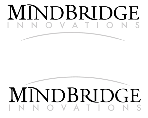
Get rid of the grey arcs in both — the ligatures express the same idea in a better way.

The direction you are taking for the type in 'mindbridge' is great. Continue down that path.

Skip 'innovations' for now.

And definitely loose the arc...all I'm seeing is a big frown.

Concuring with penn.andinka nd aluminum.

Letterspace B-R a bit.. Looks like MIND B RIDGE

I like it. I think ther has to be more space between 'innovations' and 'mindbridge' and you could remove the grey arks. Furthermore I think it would look even better if you made the swashes continue so that 'MIN' and 'RID' are connected. Good luck.

Captured from web.archive.org on 21 Aug 2013. view this capture