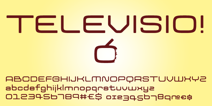
Those are some very closed apertures. Do you worry about C/O, c/o, a/e/s being difficult to distinguish?

Those are some very closed apertures. Do you worry about C/O, c/o, a/e/s being difficult to distinguish?
Don’t overthink things. Nobody is going to use this typeface for road signs around international airports. Display type that takes an extra tenth of a second to read is not a bad thing—people read all-caps fraktur, don’t they?

Nice work Tomi. How many fonts are you working on?!

people read all-caps fraktur, don’t they?
Not if they have a choice! ;-)
Captured from web.archive.org on 6 Apr 2010. view this capture