
Hey,
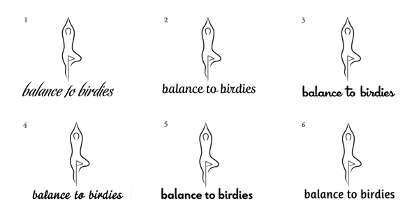
I have looked at A LOT of type to pair with this logo and I think I have decided on the the one that works best.
I'm not going to say which, but I'd like to see if others choose the same one I have.
Hey,
I have looked at A LOT of type to pair with this logo and I think I have decided on the the one that works best.
I'm not going to say which, but I'd like to see if others choose the same one I have.

Very spontaneous: Number 2, among other things because of the contrast of typeface and logo, which means, that I did not take the very darker ones into consideration because of the big contrast. And the rest is just feeling.

Is "none of the above" a good answer? ;-)
Jokes aside, they all seem a little too rigid compared to the logo.
I like #3, but, as Arno said, it's too dark.

I'd agree that #2 is perhaps best in terms of fitting with the style of the mark (but maybe it's really a tad too spiky); I'd think #3 is too plump. And perhaps obviously, anything [strongly] slanted would make zero sense with that mark, and a name with «balance» in it.
All that said, without knowing the context it's really impossible to say what kind of font you should pick: with a script font this seems more yoga/dance-y, whereas paired with a sans it might come across more sporty or wellness-like. Stylistic matching isn't the only dimension to consider.

My vote goes to #2 as well, though for some reason I wish the R was different. What typeface is that?

I'd like #3, but I'd want the line weight in the illustration plumped up to match.
#2 is good, and does match the line weight better, but with the rigid vertical flag pole, I think the vertical straightness of #3 works better.
Small nitpick on the logo...I'd like to see the hands above not quite meet, just as the feet below don't quite close in .
My choice was #3. I do see that the line weights don't match so I may have to adjust the logo accordingly. Unless someone has a similar type to recommend that matches the weight better. I also think I will tuck the type under the bent knee and try to connect the "b" in banlance to the foot.
A bit of background. This logo is for a golf and yoga seminar company. The target demo is women aged 25+ in a higher income bracket.
Thanks for all of the imput. I will post an upadated version as soon as possible.
@melo #2 is Fertigo Pro Script
@aluminum I will make a separated hands version and see what people think.
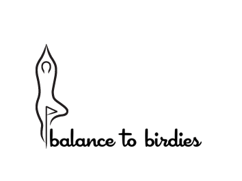
Logo with thickened lines:
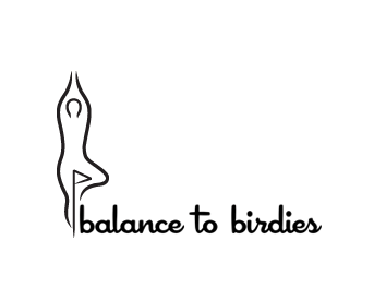
With thickened lines and hands apart:

What if the stem of the 'b' became the flagpole, and the bowl became the hole? Might or might not work.
- Lex

I like Lex's suggestion :-)
I still find Cocktail Shaker slightly too plump/round/short/comfy for this job, but if you do go with it I'd maybe try making the crossbar of the "t" less prominent (shorter).
@Lex I see what you're saying but I don't want to fix the type to the mark. I want to be able to separate them for golf balls and other swag.
@altaira I do see it as too plump as well. I'm going to have to look for something else. Any suggestions for an upright script?
.
I like the mark plumper, for sure. There's still an inconsistency in the line quality between the mark and the type, though.
The type has a variable weight stroke. It might be interesting to incorporate that into the more prominent strokes in the mark (outer two). have the lines a little thinner than now in spots and a little thicker than now in others.
Also, IMHO, the latest lock-up has the mark too close to the type. I think there needs to be some breathing room between the two.
I'm not sure, I think it's more than stroke weight… the figure is balancing and rising up almost like a flame while the x-height region of the type is crouching around on the baseline. But really, maybe it's just me.
The bad news is I suck at scripts, and can't think of anything right now that I'd think might be a better fit. :-\
I think this is what I'm going with:
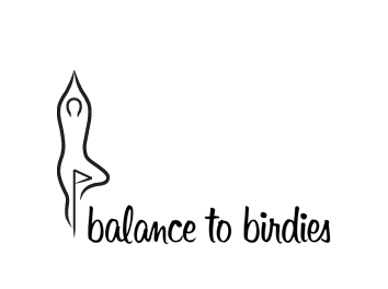
Sonora. It matches the stroke weight and a fun feel that the client wanted. The stems are not as upright as I would have liked but I still believe it is a good fit.
Thanks again for all of your feedback.
Captured from web.archive.org on 11 Oct 2013. view this capture