Typophile

Estonia Nouveau Release

TypeSETit

Here's the font I've been working on for the past month or so. It should be available at Myfonts.com.

750 glyphs...
Thanks again to those who helped me with foreign characters and even naming the font.

RL
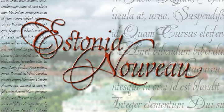
There are other images of the font in the Villu Toots threads... so I won't post them here.

RL

Fantastic.
Love the texture in it. Hope it sells well for you.

I'm getting dizzy just looking at all those spinning flourishes!
What is that in the E, a triple Salchow?

Nice. The quality of fine calligraphy is beautifully captured; it doesn't look "false" like so many script fonts, or stilted, which is the downfall of too "correct" formalism.

I don't know how much of the balance it strikes is due to the distressing. Are you considering a smooth version? That would be the acid test.

Nice work!

Are you considering a smooth version? That would be the acid test.

Yikes. While it CAN be done, I'm not sure I have the energy to smoothen it up ... 750 glyphs and literally hundreds of nodes per glyph. Let's see how popular it is before I consider it.

And that's a triple lutz... geeeze what a rookie comment.

:)

Not to dredge up an old post, but...WOW!!!!!!!!!! That is a very pretty font. Well done.

thanks

Captured from web.archive.org on 13 Oct 2013. view this capture