
Hi fellas!
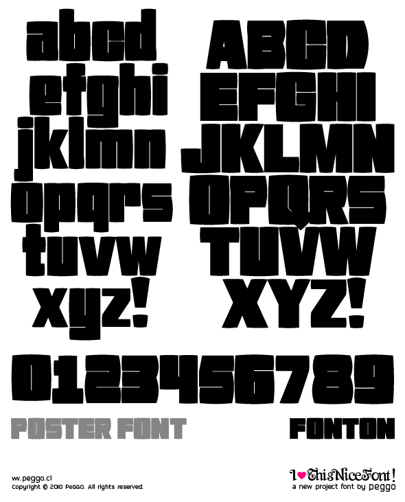
I was make a new font thinking in posters design, my inspiration was the "Ton" shape then leave really soft curves for each line that we need to solve.. hope you like it and if you want drop a comment or critique.
regard mates
Pedro
Pedro
Uppercases
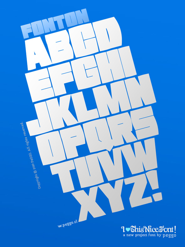
lowercases
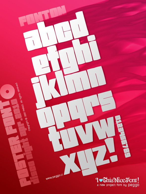
Poster sample
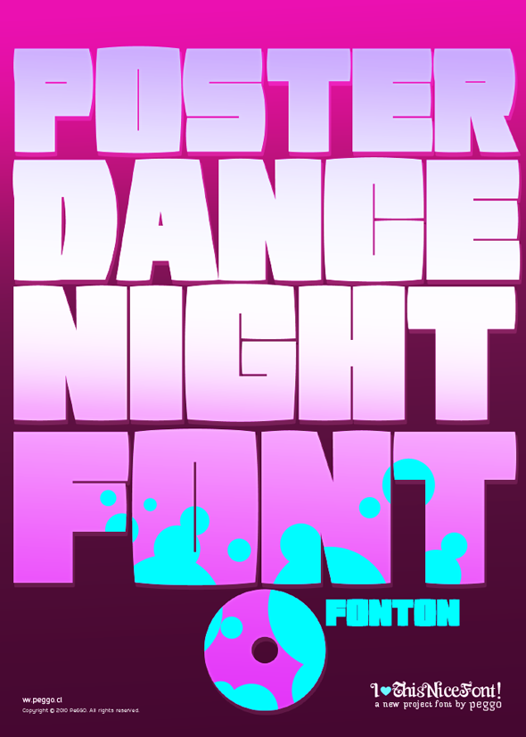

Why do the tops of, say, /U/ swell but not the top of, say, /L/?
I don't quite get the top of /1/.
I rather like the illogical /Q/ counter!
Thank you Eliason.. top of /L/ is a mistake that needs to solve like you said cuz I design this with separately little shapes and sometimes leave open and finaly don't work like is awaiting..!!
I think /1/ need grow up the curve a little bit or the entire gliph, I'll test it.
and /Q/ counter, well.. I really think that's not need help to be readable and clearly diferent between it self and /O/ counter.. and so.. and I expect this font will come to make unique specially for this kind details.. haha.. may be some people not like.. may be and surely some peoples could love that detail.. I don't mind yet.. need some opinions else.
Thank you for notice me about that details and drop your advices.
Z,z lack weight in horizontals. Set words like "SIZE, prizes" and you'll see how much it stands out.
Thanks Kevin.. I'll try.. so useful notice too.. :D I'll follow the "7" pattern for "Z" and then adjust its respective lower.. thank you so much
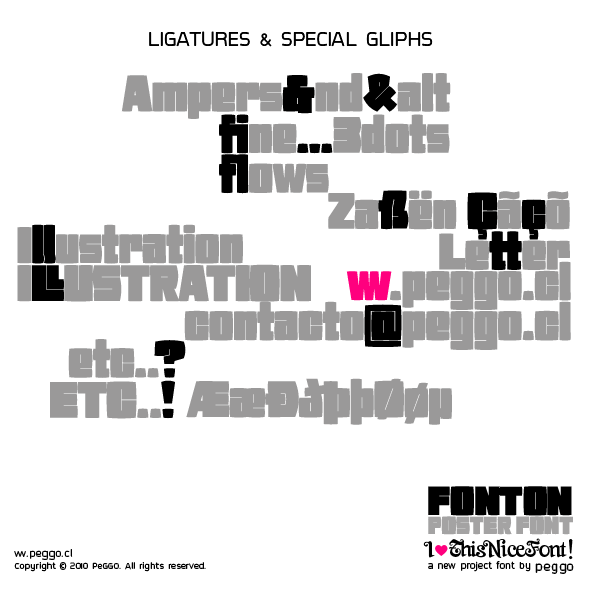
a little update on another gliphs.. and can see the special ligature called byme like "triple v" that represent "www" apostrophe, done for reduce visually space and leave clear the reference to some web link.
feel free for comment and critique.
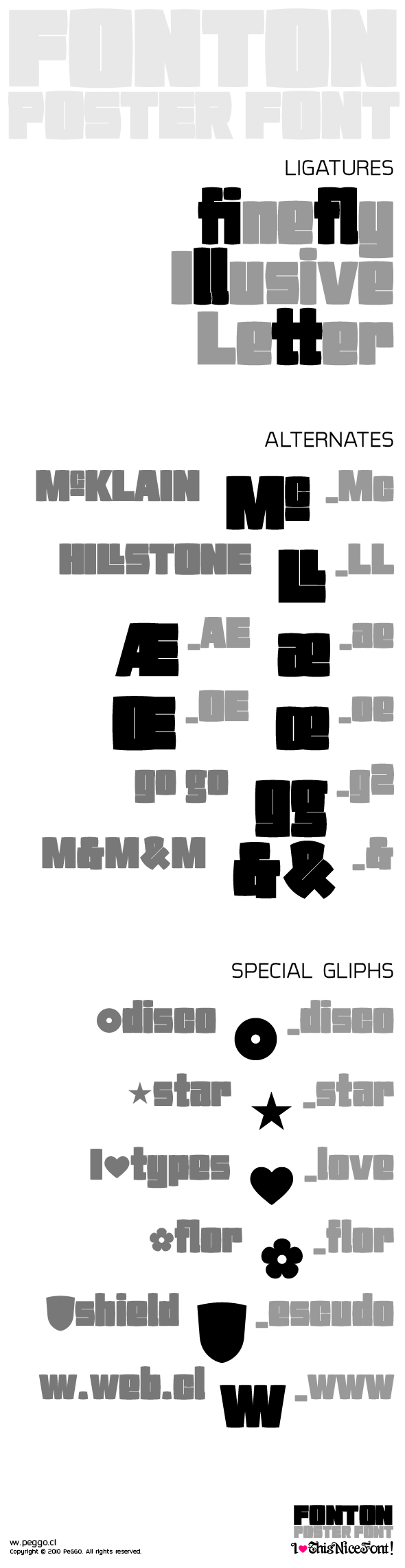
I really like this font - and I think it works perfectly as a poster font. Could it be, that the small s has totally flat tops and bottoms?
You right Malte, it is actually flat.. but I still making changes on this font and I'll try specially now this "s" with curves, you've a good eye... hehe. ;) Thanks!
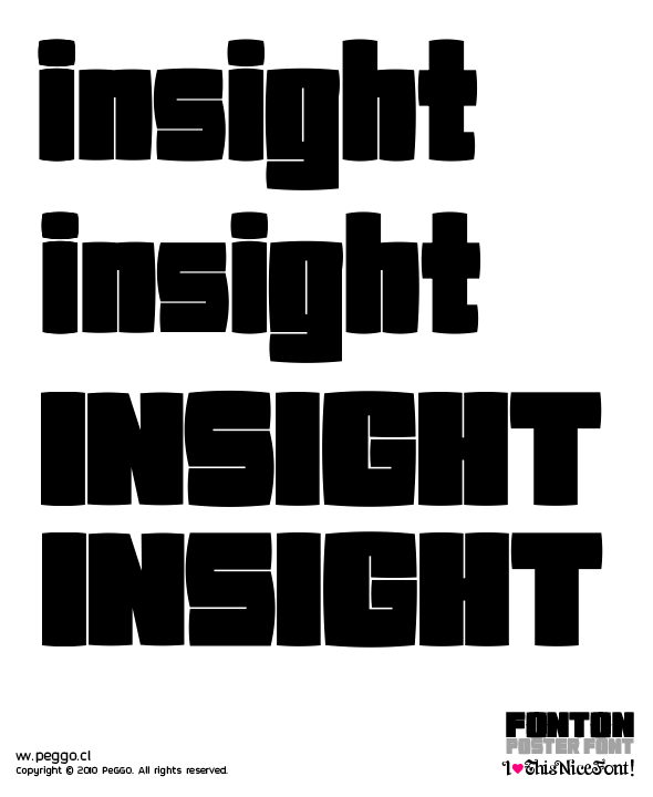
1st phrase "insight" below have curve example of "s" and 2nd the flat one... same for "S".
Here I done a test for compare the Flat and Curve "S" and "s"... Honestly I like the flat version, In fact, now I grow flats gliphs a little to compensate the visual weight between flats and curves shapes.
Thanks and regards!

I really like your ampersand. Very original and stylistic.
btw "AJ" I believe this both can work better now with OTF alternates now instead regular ligature option.. =)
respects my bro!
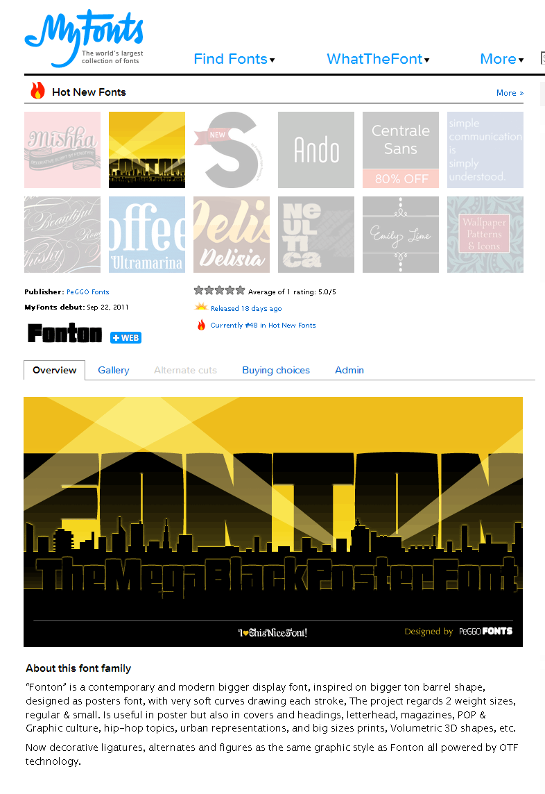
Finally... Fonton is now avaliable on MyFonts... :D
http://new.myfonts.com/fonts/peggo/fonton/
that's happend recently at few minutes.. today, and share the good new with you dear mates cuz I'm happy..!!!
And btw new cyrillic little update on Behance portfolio
Best wishes for you.. :D


some updates of cyrillic part of "Fonton" here like poster show version
Captured from web.archive.org on 14 Apr 2015. view this capture