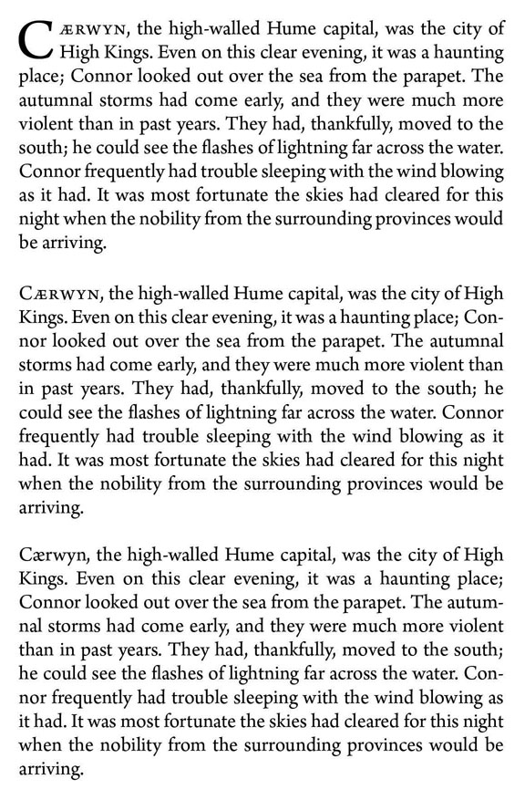
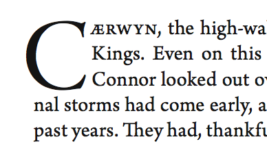
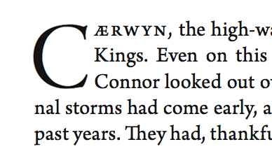
I am currently in a bit of a pickle. I like drop caps at the head of a book chapter... more specifically, I enjoy the pairing of drop caps and small caps for the first word (or three) of the chapter.
My problem comes when the height of the drop caps. right now, I am using a two-line height with small caps for the first word.
My question to those of you who've worked with books is: how do you choose to lay out the first page of a chapter?
I've attached the current design of the first page of chapter i. It looks so... boring. I'm a fan of the crystal goblet school of thought, but it just seems to be missing something. Please be as highly critical as you please. I'd like it to look as good as possible, obviously.
| Attachment | Size |
|---|---|
| Spread 1.pdf | 182.86 KB |