Typophile

Abril in Progress

TypeTogether

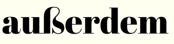
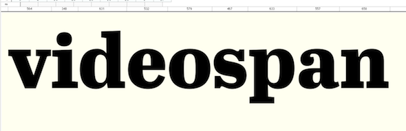
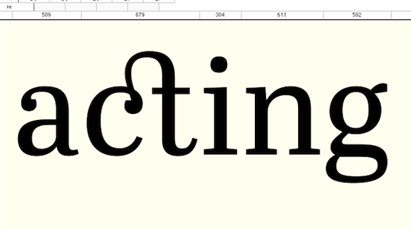
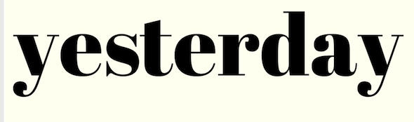
Abril, the new typeface by Veronika Burian and José Scaglione is on the way. It is a font family engineered mainly for newspapers and magazines that features friendly and elegant styles for headlines and robust and economic styles for text. For the first time ever, we will be posting images showing the progress of the develoment of a font family. So stay connected to our Flickr group!

http://www.flickr.com/photos/typetogether/sets/72157623684586626/
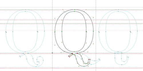
The first "Q" is best, and after quick look, the "a needs work. Overall very good indeed.

I think this is really elegant. Can't wait to see more.

Abril progress updeate.


More pictures on Flickr http://www.flickr.com/photos/typetogether/sets/72157623684586626/

Nice! :-)
But I think the thread should be moved in Critique > Serif

whoa, those terminals!

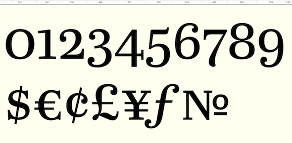
Wow, those numerals!!

As usual, an excellent work from TypeTogether. Some small observations:

1. bottom part of g seems a bit rigid and large. It could be narrower.

2. ordinal in numero sign seems to be a zero, but it would be a superscript |o| because Nº abbreviates the word Numero.

3. section has a nice and original design, but I guess it would be considered too fancy or not easily recognizable in Law texts, where it is largely used.

I just saw this.
Very cool of you to do this!
How open are you to critiques?

FWIW, in Armenian "Abril":
1) Is the name of the month (no big surprise).
2) Means "to live", a lyrical contrast to the Armenian Genocide which we commemorate on April 24.
3) What I long wanted to name a daughter, but when the time came my wife objected. :-/

Then there's Victoria Abril, a fabulous actor.

hhp

Captured from web.archive.org on 17 Apr 2015. view this capture