
Tournedot is now available from MyFonts.
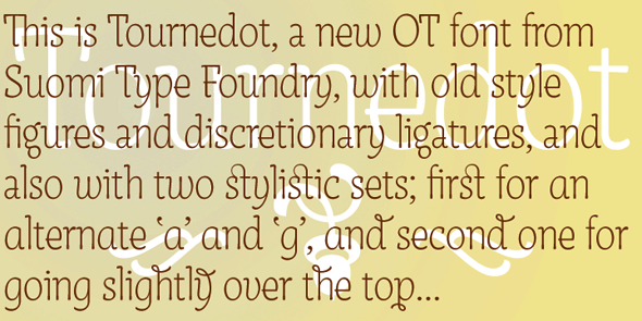
P.S. Cider Script has also creeped up to top ten on Hot New Fonts-list…
| Attachment | Size |
|---|---|
| Tournedot.pdf | 114.07 KB |
Tournedot is now available from MyFonts.
| Attachment | Size |
|---|---|
| Tournedot.pdf | 114.07 KB |

Well done, very stylish Tomi, I prefer it to Tempest. Is this the only weight?
Thanks, Nick-
For now this is the only weight, but I'll make a thicker weight later this spring, and also italic variants.

wow Tomi, you are pretty fast, 5 days ago you said in another post "Some glyphs still need work, and kerning is just in it's infancy, but you get a feel". Thats what I call a fast growing, lol. Its a nice one.

Beautiful design. I'm impressed with the velocity you produce these amazing fonts.
Thanks, guys-
Over the years I've developed a routine that helps me to design a basic characters set wit some speed, which allows me then to go back, and review the result without any real loss of production time.
Some five years ago I started wondering if this method was the best one, and experienced with other ways of font design, like hand drawing and scanning; drawing in Illustrator, and copying and pasting into FontLab; and mixing the order of designing glyphs. In the end I kept to my old method.
I've also made a conscious effort to use more time to make a font, and after three or four weeks of tinkering I compared the first version to the version I used more time on, and saw no real improvement, so once again I kept to my old method.
For me one week is about average from idea to a finished font. After that it slows down; italics and different weights take a lot more time, and finishing a complete font family takes months easily.
For example, today I made this Helvetica'ish thing to compensate for those serif fonts:


For me one week is about average from idea to a finished font.
8-O
8-O?
It's my reaction, as an emoticon. :-)
Ah, indeed it is. I was wondering if I was taking part ina game, and winning big…
Nick; you gave me a courtesy by giving me your critique by e-mail, rather than here on the forum, and that was very decent thing to do. I hope you don't mind my quoting you here.
From your point of view Tournedot "looks like hand writing, but the repeated details are too consistent for that. Therefore the effect is false. Contextualization in OpenType is a new idea that addresses this issue. So far it has been used almost exclusively for script faces."
After some mulling over, I have to disagree. After waiting some twenty years since PostScript, we actually have a chance to use ligatures and alternate characters, and you want to discourage designers to impliment that possibility. Tournedot is a font, not lettering. It is not following traditional type design dogma, but rather looking for the boundaries of it (sorry; that sounded suprisingly pompous).
I understand that this new technology can cause the same confusion that happened with lithography in 1900'th century, when suddenly any form was possible for printing. We saw the same thing with PostScript in the 90's, and with OT, we'll see more.
Each new technology needs to find its limits, before it can find its best qualities. This applies to OpenType as well.

...we actually have a chance to use ligatures and alternate characters, and you want to discourage designers to impliment that possibility...
No I don't. Ligatures and alternates ARE contextual. For instance, one would not set "d with flourish" when followed by "l".
So I approve of your alternates and ligatures!
Nonetheless, I still think you could use alternate glyphs to give an impression of the subtle variations in serif form that occur with hand lettering, rather than just for alternate letter-shapes.
Actually, you needn't even do that: just don't rely so much on cutting-and pasting, but take a little more time to hand-craft each glyph individually. The overall effect will look more human, less plastic.
Tournedot is a font, not lettering.
Then why does it look like brush lettering? The swelling of the vertical stems towards the baseline, the "brushy" serifs that begin and end strokes, the non-geometric, organic curves, the softened corners, the casual jauntiness of "g" and "y", the large counter in "e"--typical of mid-20th century brush lettering, &c, &c.
It is not following traditional type design dogma,
Yes it is.
It has the traditional regimentation that has generally occurred when a hand-lettering style is turned into a font.
For instance, all the letters stand precisely on the baseline in a way that hand lettering never could achieve.
If you are going to design a typeface which is so strongly informed by hand-lettering, why not use available technology to do a better simulation than was possible in the past?
Alternatively, if you want to make it more "font-like", impose a greater degree of regularity and stylization; refine it more. For instance, make the "entry" serif on "i" and "n" the same.
At the moment, the idea is not fully realized: it is caught between being a simulation of hand lettering and being a fully refined and rigorously stylized typeface.
Does it look like brush lettering? I can not see that. I thought it looked thin enough to be not that lettering-like.
I do not see it as brush lettering; to me it's just another font with some new forms.
I'm sorry to upset you like this, but I stand behind my design; Tournedot is a font for headline use with two different stylistic sets.
I'm not upset.
You asked my opinion, I gave it.

Does it look like brush lettering?
Just a bit. Maybe more of ballpoint pen lettering ;-)

Tomi,
The design is nice, but i also agree with Nick. The font is really caught between types. I see it as a heavily formalized script font. But, even that description does not seem right either, since it doesn't flow like a script font should.
I would call it, as riccardO suggested, a ballpoint font, more than anything else.
The forms do look nice, and the alternatives are a neat thought.
I do understand what Nick is saying though. You've headed in two, possibly three, directions. I think you need to choose just one direction.
Captured from web.archive.org on 7 Apr 2010. view this capture