
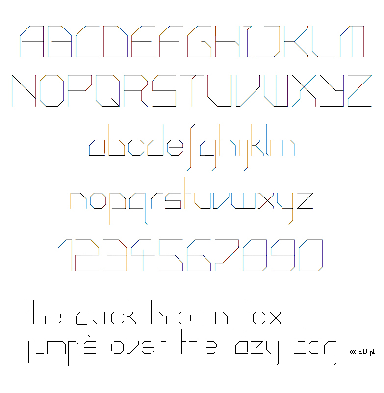
ideas? thoughts? opinions?
all would be appreciated.
ideas? thoughts? opinions?
all would be appreciated.

I like this style.
Too me there seem to be some inconsistencies, for example the simplicity of the small z compared to the small x. I would rework R and W. I understand your 7 but it could look nicer.
many thanks. just gave them a quick rearranging as well as a bolder version. wanted to leave the W but looking at it again i think you're right. needs widening.
Captured from web.archive.org on 23 Jul 2014. view this capture