
any help with finding something similar to this wood type grotesque - its not helvetica or trade gothic, or franklin gothic...
any help?
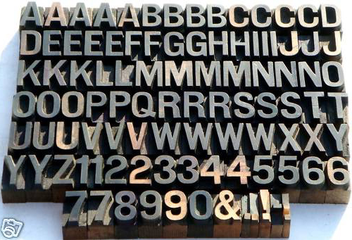
any help with finding something similar to this wood type grotesque - its not helvetica or trade gothic, or franklin gothic...
any help?

It looks like an Helvetica semi-condensed. If such thing exists.

Can't tell for sure, but some of the characteristic letters are really reminiscent of Permanent Bold, a Ludwig & Mayer grotesque from the early 60's. Maybe there are also a few irregularities stemming from the transfer of the design to wood type.

Tough riddle. Not quite Permanent though.
Some caps are similar to “Normal Grotesk” which was a design cast by many foundries pre ww2 under different names like Edel-Grotesk, Aurora, Favourit etc, at least in metal.
In fact, the type looks rather handmade, the figures even like not really belonging to the rest, the 3’s differ quite a bit. (The 2 feels very Nebiolo.)
Would be easier with lowercase. Or do you have any rough information about age and where it comes from?

Permanent

Normal Grotesk
((looks like we had a similar idea for our picture, jstypo))
According to Jaspert, Berry & Johnson's Encyclopaedia of Typefaces, 4ed, 1970, kupfers Permanent specimen is labelled Medium and seems somewhat lighter in colour than Dash_X's specimen. Permanent Bold is definitely darker and the numerals are all notably narrower. It might be helpful to see the lower case alphabet. The specimen's letters that have rounded strokes seem a little squarish. Perhaps that is why kupfers showed us Normal Grotesk. The irregularities are quite intriguing.
Permanent was designed by German calligrapher Karlgeorg Hoefer, also known for the Monsun (Monsoon) display face from Klingspor and script faces Elegance (Ludwig & Mayer), Saltino and Salto (Klingspor) and the curious tinted Zebra from Stempel among others.
I couldn't find another similar typeface amongst those displayed in the EoT quite like the specimen fount.
PS kupfers: your kupferschrift.de is a very interesting web site, I'm glad you also write in English, my German is practically non-existent. Thanks for sharing.
hhmm, very good work , i don't have any more images to offer. The seller had no idea what it what was - the set was 1" with no id markings.
is a digitized Normal Grotesk face (or Permanent for that matter) available anywhere?

These wood letters are not from before WWII. They are around 1970 up to 1975. Otherwise they'ld would look much more older. Wood is a living material.
If you are interested to see more german wood letters:
http://www.bleisetzer.de/cms/front_content.php?idcat=36&rubrik=Holzlette...
Regards,
Georg
@sinoran_knight: As far as I know both, Normal Grotesk and Permanent, are not available in digital format, apart from one single headline font of Permanent by URW++.

thanks for the link to Bureau Grotesque
Captured from web.archive.org on 6 Aug 2014. view this capture