
I just released Tempest, a headline serif font in MyFonts, but while I worked on that, I wanted to make a more playful, whimsical little brother for it.
Some glyphs still need work, and kerning is just in it's infancy, but you get a feel for the font here:
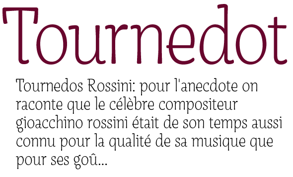
I'm thinking of making some alternate glyphs; a and g are done already. I used them on the pdf, so you can see them there.
I started with a serif design, but veered off pretty quick; Tournedot needed something different, so I turned it into a semi sans with pretty galligraphic tones going on with V, v, W, w, A, M and so on.
What do you think?
| Attachment | Size |
|---|---|
| Tournedot.pdf | 112.42 KB |


