
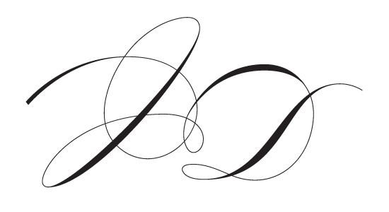
I realize I suck at this. Perhaps someone can give me some suggestions for improvements? The letters are J and D.
I realize I suck at this. Perhaps someone can give me some suggestions for improvements? The letters are J and D.

I think it would read better as a J if you put a cross-bar on top. Whenever I have to do a monogram I just use Bickham script, type the letters and a few ornaments, expand them and try and join them together somehow. Some letters are easier than others - J is one of the hard ones!
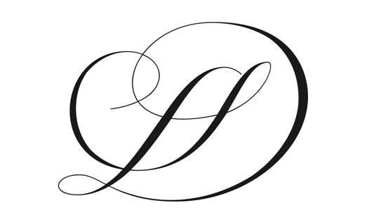
I made a completely new one.

The new one is much better.

That's more attractive, but I don't think I'd ever get "JD" out of it. :-( Almost looks like "LS" to me.
I don’t understand much about where thicks and thins should go (or anything really). This is cleary not my domain, at least yet. I’d love to learn more though.
Craig: Any suggestions on how I might solve that?

The new one is a wonderful SD!
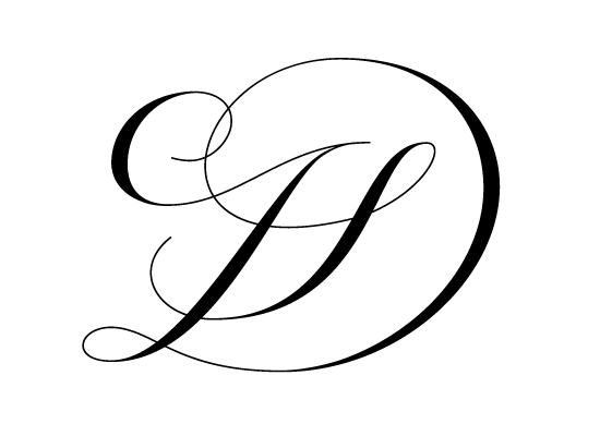
Instead of using the first stroke for the D, I’m trying a version where the first stroke belongs to the J. I added a “crossbar” (top bar?) as well.
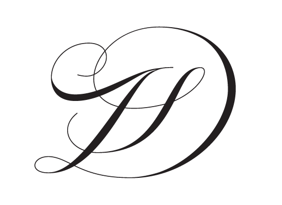
A better solution for the J.
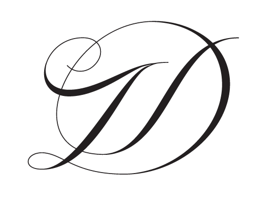
The last one is the only one that, to my eyes, doesn't comprise a S.
But, unfortunately, J still has lot of T about it.
With a tricky letter such J, I think you should clearly show the descender, instead of trying to incorporate it.
Have you tried to modify your 6.46am one transforming the leftmost curl in the J's descender?
@Riccardo: Modify it how?
Sorry for the crudeness:
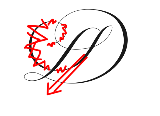
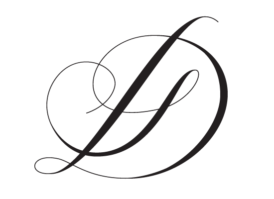
Riccardo, I tried that, but it completely throws off the balance.
Riccardo, I tried that, but it completely throws off the balance.
Yes, I supposed that. But maybe going for a more upright style?
As for your last version, I think it could work with a crossbar.

I think the tail of the J needs to drop down below the D - also perhaps vertically flip the top of the J that you had earlier, the three versions that you had tried, so that the curl is facing down instead of up.

I don't think you suck at this, your forms look good to me. I did this sketch to show how you might want to heavy up your shades (thick parts of the letters). Heavier shades will define the letters more and differentiate from swashes.
I know you're trying to combine the two letters so it's all one continual stroke, but that may be what is preventing the J from really standing out. If you want the design to be all one stroke, make sure that the transition from one character to the next is thin... any thickness will be confusing.
Also, I've made the J stem and the D share the same double stroke... why not let them really echo each other? Like they're dancing... let them hold each other close. Just my two cents for what it's worth. I know you'll end up with a great design.
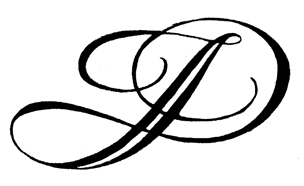
I agree with TypeSEtit, you need to add weight to your where your stems would be. Also, I would consider experimenting with a cursive "J", one with an upper and lower loop. I think you could make some nice vertical rhythm. Even for the fanciest of uses, such as wedding invites, I think there is room for completely straight portions, it adds a degree of variety that just makes the whole thing look more elegant when balanced nicely. Imho a fully curved monogram tends to be too flourishy, too decorative.
Please excuse the rough comps, just trying to provide my train of though.
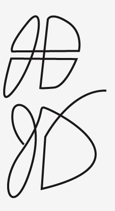

the forth option is nearly there. For me the only problem is the inner stroke of the D, it looks like an s JSD…
I would have guessed LSD - These are really beautiful, but I'm just missing the J every time, maybe there needs to be some more emphasis on the lower area of the J?
An old thread, mr. AwesomeRobot.

I have a similar problem creating my IP monogram.
http://typophile.com/node/74828
I end up looking like a J, and P end up looking like a D
Funny :)
Captured from web.archive.org on 1 Feb 2015. view this capture