Typophile

Path Direction Question

TypeSETit

I have been converting fonts from PostScript / TrueType that I originally designed in Fontographer to OpenType fonts using Font Lab 5.0.4 MAC version.

In Fontographer, a CORRECT path direction is defined as having the outer contour or path of a glyph running clockwise, and the inside counters of a glyph running counter-clockwise. An INCORRECT path direction will result in the character looking heavy.
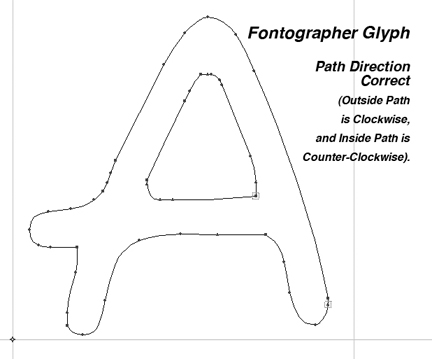
It appears to me that FONT LAB has the paths running in the opposite direction from Fontographer. Is this true, or am I reading it incorrectly?
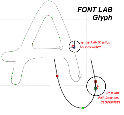
Does it matter which direction the paths are created so long as the counters run opposite to the outer contours? If so, which is correct... the way FONTLAB defaults, or the way FONTOGRAPHER says paths are correct?

This is a matter of curiosity AND I need to know before I go into over 700 glyphs to make sure they have correct paths.

Thanks in advance.

RL

I don't think it matters - just depends on whether you're making PS or TT flavoured OT. PS flavour has outside contours running anti-clockwise. I usually just select all glyphs and change contours to postscript.

They should be all consistently PS or TT. Otherwise letters that overlap either on purpose or through negative tracking could show white where the crossover occurs.

I need to know before I go into over 700 glyphs to make sure they have correct paths.

Checking/fixing this is something FontLab can do for you!

Checking/fixing this is something FontLab can do for you!

Yes, but it's something FontLab does oddly, at least for me. If I select all characters and then select Contours > Paths > Set PS Direction, the contours which have changed are indicated by a black bar at the top of the affected glyph box. When I save the changes, the black bars disappear, as they are supposed to. But if I perform the same operation later, several of the previously-corrected glyphs show the black bar AGAIN, even though nothing has been done to the highlighted outlines in the interim. As I said: rather odd...

They should be all consistently PS or TT. Otherwise letters that overlap either on purpose or through negative tracking could show white where the crossover occurs.

Yes, that is what I was thinking. After I asked the question, I did some testing... Generated a font in Fontographer as both a PS file and a TTF file. Looked at them, and the paths were different, but consistent in each font.

I still wonder why FONTLAB would render PostScript paths in the opposite direction from what Fontographer calls "correct" path. Or am I just misunderstanding what those little arrows in FontLab are actually pointing toward?

RL

FontLab Studio renders PostScript paths in the direction recommended by the Adobe Type 1 font format specification: the outer path runs counterclockwise. See http://www.adobe.com/devnet/font/pdfs/T1_SPEC.PDF pages 27-28.

That's what I was wondering. Thank you Adam.

Does that mean Fontographer is mentally challenged calling the "correct" paths in the opposite direction from Adobe's recommendation?

I wonder if it has anything to do with way back when... Altsys developed Fontographer, Freehand, and PageMaker... competitors to Adobe.

I've checked and Fontographer 5.0 (soon to be released) behaves the same way as the Type 1 spec and the same way as FontLab Studio.

Captured from web.archive.org on 9 Jul 2011. view this capture