Typophile

Oldstyle figure height for currency symbols?

Jason Pagura

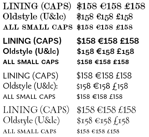
It's something I've never thought much about but I've seen it in a few fonts of late. Some fonts with oldstyle figures include currency symbols at or near the smallcap/OSF height. It seems like a good idea if you're going to have oldstyle numbers, but how frequently is this done? And which symbols should correspond to which of the varying number heights?

Depending on the font, I make up all the currency symbols, a numbersign, and the arithmetic operators. Size & position to fit comfortably with all the old-style numbers -- a bit of compromising is involved. Switched with the numbers in the lnum and onum features.

Also a colon, so, for example, 12:24 spaces better than the with the text colon. I include i, v, and x in the conditional set to include front matter roman numerals.

Again depending on the font, I may make up a tabular comma and period as well.

My recent practice has been to include three sets of currency symbols:

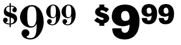
If I am feeling particularly ambitious, I also include superior currency symbols:


(The fonts cost a bit more than that.)

> (The fonts cost a bit more than that.)

Just as long as they don't cost 158 Euros in Europe, 158 pounds in England, and $158 in the US.

The Mod Suite fonts are U.S. $78 each.
The way things are going, that will be €78 and £78 pretty soon, not to mention Canadian $78, which it is already.

Captured from web.archive.org on 1 Jul 2014. view this capture