Hello, I am new to these forums so firstly I apologise if I am posting this in the wrong section.
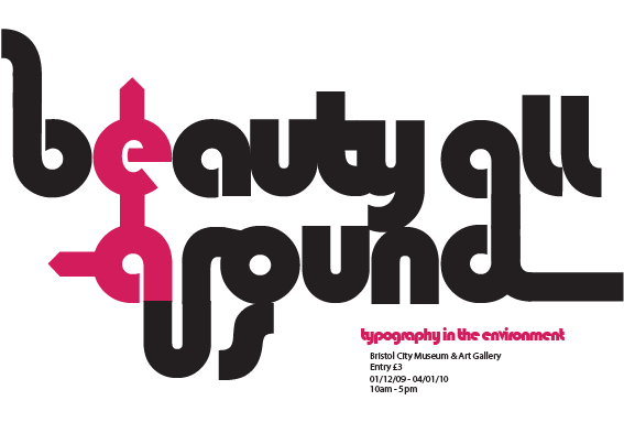
I am a graphic design student currently in my second year of my college course. One of our projects was to design a poster, ticket, invitation and envelope for an exhibition called "Beauty all around us". The exhibition is about typography in the environment and we were asked to experiment with legibillity and design showing the relationship between them.
My initial idea came from road/motorway signs and what they would look like without text, this then developed into using symbols in the typography its self to create the design below. This is the poster design. Any opinions, critiques or questions please feel free to share, and again I apologise if I am in the wrong section of the forum.