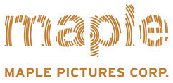
The first time I saw the original Maple Pictures logo I knew the $12.50 I'd spent was worth it, even if the movie was a piece of piss. The way the animation rotated and the tree rings formed the letters just struck a chord in me.
AND THEN THIS HAPPENED!

What in the hell were they thinking? What does this say other than we typeset some letters and put a box around them?
I have started this thread hoping to see you add other logos/branding that were redesigned so poorly that you're left wondering "How did this happen?"
Pepsi anyone?