
Anyone recognize this one?
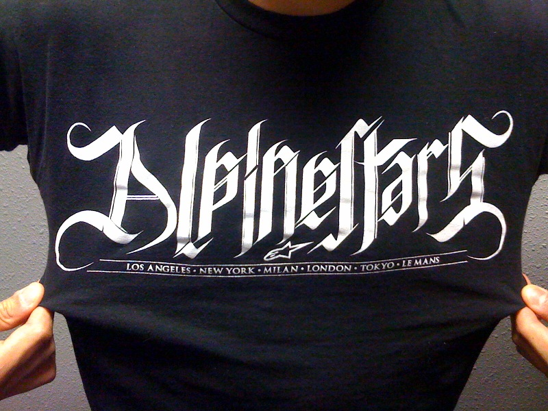
Anyone recognize this one?

I don't think it's a font. The combinations lp and sta are too much "tailored to fit". IMHO this is calli... er... ugligraphy.
Andreas

Does not fit pen logic. It looks like either hand drawn or done in Illustrator.
Captured from web.archive.org on 31 Jan 2015. view this capture