Typophile

(x) Wood type alternative / bold condensed grotesque - various suggestions {gang}

sarahcazee

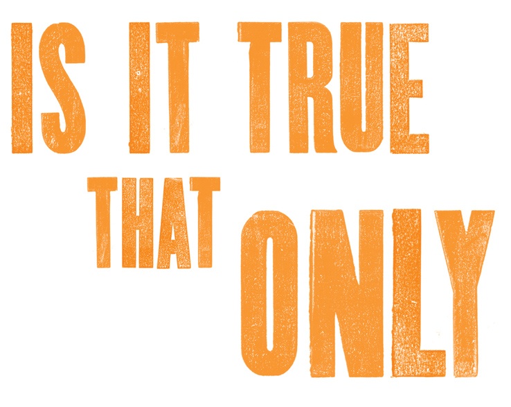
I think type ID is the right spot for this, though I set it myself with an alphabet from withoutwalls.com.

Now the client wants to see it in a real typeface. Does anyone know of any that are similar? At least in weight and height? I love this but there's just no way they'll go for it unless it's a font.
Thank you! I

Champion and Knockout from H&FJ are based on wood type like this.

I digitized one fairly close to that:

https://www.chank.com/shop/detail/3/font_packs/19/blinctype_letterpress_...

(Goshen)

At large sizes, though, nothing beats the real thing (or the photographic facsimile of it).

Try Knockout from H&FJ.

Ohh, what bad luck! H&FJ is down right now! Champion does look like it might work.

Goshen is super close, but I need something a little taller, a little straighter, a little more uniform. Any ideas? Unrealistic deadlines are looming!

Take a look at Enge Holzschrift from Dieter Steffmann.

Enge Holzschrift is really nice, the R is spot on. Does anyone have strong feelings for Grot Rough? I'm not sure how I feel about it. It's just not as interesting as the original.

Captured from web.archive.org on 18 Feb 2015. view this capture