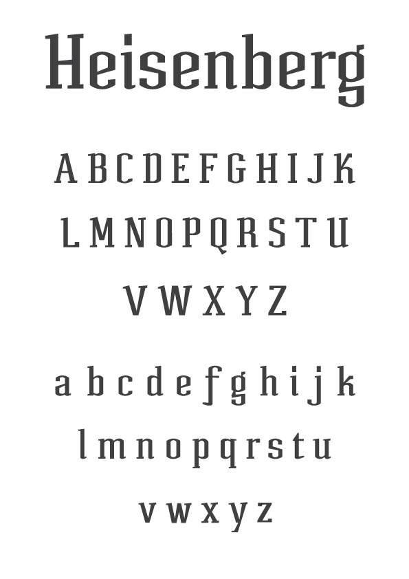
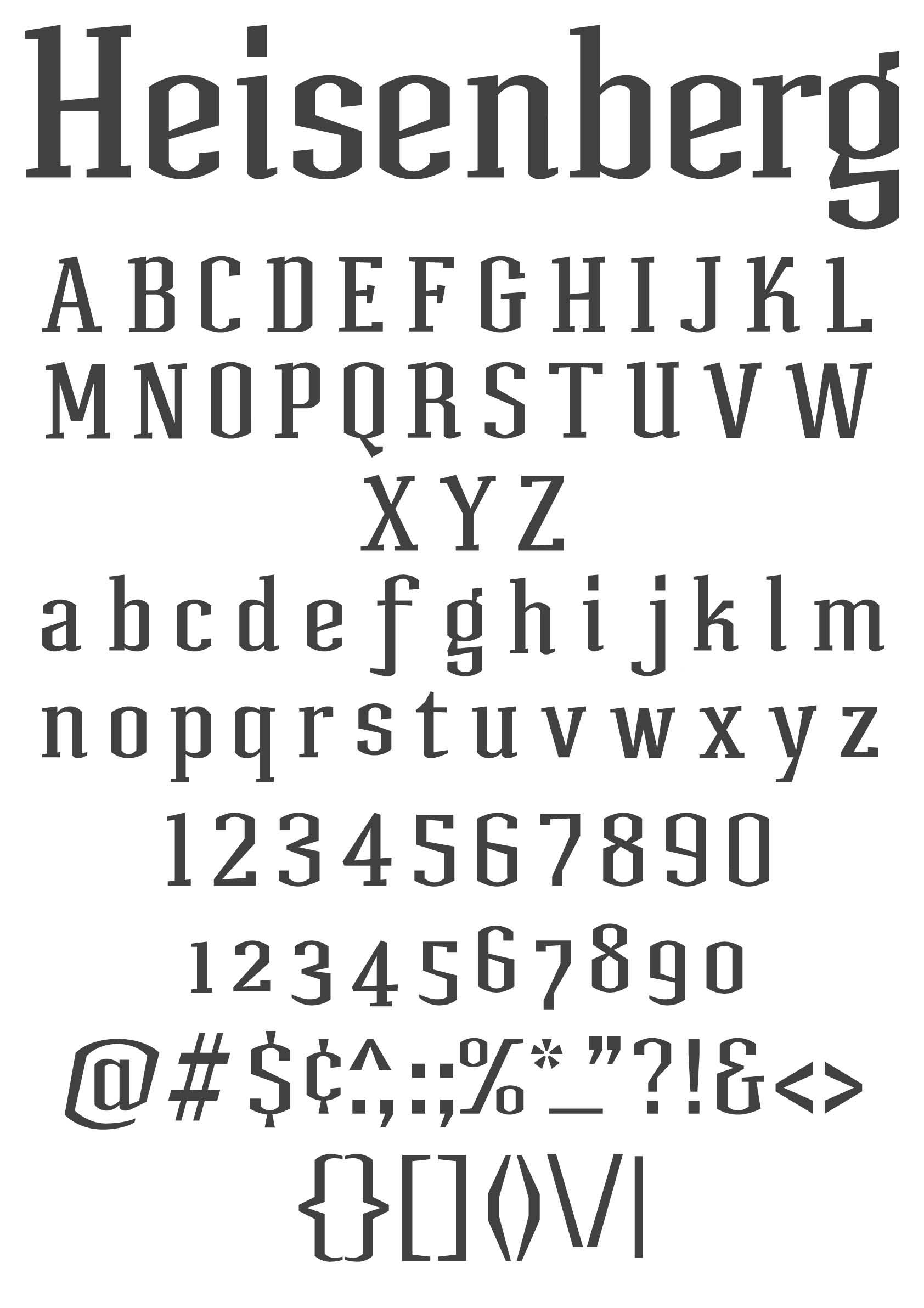
This started off as a logotype consisting of two letters; 'ei'. It actually began as a sans (which I'm still working on) but ended up finishing the serif version first.
This is the first time I have ever finished upper and lowercase Latin alphabet and since I have never really studied typography I am in dire need of some constructive feedback.
Also, have a guess where I got the name from..
Cheers in advance
12/8/2010 - Update - Ive added a few bits and addressed some of the issues raised here. Please give more feedback if possible. Also, do type designers do all the hinting etc themselves these days, or do most get them mastered by pros? Not sure if I have the patience to do 7000 kerned pairs..
| Attachment | Size |
|---|---|
| Heisenberg_draft_sheet.jpg | 46.84 KB |
| Heisenberg_draft_sheet.pdf | 29.59 KB |
| Heisenberg_samplesheet_UPDATED.pdf | 22.51 KB |
| Heisenberg_samplesheet_UPDATED.jpg | 234.03 KB |