
Looking for general feedback. Anything you would change with this logo? Any advice would be appreciated. Thanks in advance.
| Attachment | Size |
|---|---|
| truebearing.gif | 7.8 KB |
Looking for general feedback. Anything you would change with this logo? Any advice would be appreciated. Thanks in advance.
| Attachment | Size |
|---|---|
| truebearing.gif | 7.8 KB |

Not sure about the cut of the branch of the r.
Thanks riccard0. Should I use more of a Helvetica "r"? You'd like to see it vertical?
I'm finding it difficult to get the spacing perfect in "true"
Considering they're both next to vertical stems, I think they would be better Helvetica-like.
That should make easier to space "true" too.
Also I would try to loose a bit the vertical spacing too.

To me the type is a bit of a mess. I see random cuts to most of the letters and none of it lends any flow. The curved cut on the 'g' is especially unsettling to me. It looks like you started with Arial which isn't the most solid ground from which to start.

Way to much detail... This logo is more of a clipart than an actual logo.
exactly what I needed to hear!

I also think, with the "leading" so much smaller than the letterspacing, it looks a little sat-upon.

I'll second eliason's comment. I was thinking it might look better with tighter letterspacing--that, and PICTURES seems to be way too close to BEARING.
It's so clustered and compact, I and the type need some breathing room .

late chime in but yes...lose the detail.
think more abstract(ly) about the meaning of true bearing.
good luck, and keep us posted.
----------
Paul
Design Studio Melbourne
I'm amazed at all of the feedback. Thanks everyone. Here is my first stab at a redesign.
I'm seeing more of a stopwatch now.
Also, I wonder whether you're trying to recreate something more photorealistic based on the flashy and expensive film production company logos you see at the beginning of films...I'd forget that for now and try and work out exactly how you want to say what you want to say.
i.e, it doesn't have to be a literal "oh riiiiight, it's a compass cause it's about bearings" concept.
sailing, landscape, discovery, shifting view/perspective/location etc etc etc
Paul
----------
Design Studio Melbourne
Thanks Paul. You're right in that I'm thinking about the awesome intro animation of a compass spinning then stopping and melting into the logo.
I knew the stopwatch would become an issue.
As for the meaning of the compass and name. The client wanted a logo that showed the direction from Hollywood to Ottawa (Where the company started). I know he and his partner like the compass idea so I would have to sell them pretty hard on something else. I'll try harder to think about it outside the box.
you might consider some older style compass designs, like these:
http://www.techhui.com/events/event/listByDate?date=2009-05-30
http://castalinecharters.com/ist2_3521199_old_wind_rose_compass.jpg
the compass is more of a star. Looking more like a star could definitely be a plus too, like the company produces stars lol. it'd be a very subtle subconscious design element, maybe.
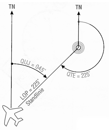
In land navigation, a bearing is the angle between a line connecting two points and a north-south line, or meridian.[1]. Bearings can be measured in two systems, Mils and Degrees.
The client wanted a logo that showed the direction from Hollywood to Ottawa (where the company started). I know he and his partner like the compass idea so I would have to sell them pretty hard on something else.
Looking more like a star could definitely be a plus too, like the company produces stars lol. It'd be a very subtle subconscious design element, maybe.
I think you've got a good start and a few interesting design directions to choose from. I also think you should develop and sell the compass mark by itself instead of clumsily trying to lock it in with some random typeface. Choose a typeface later when a mark has been decided on.
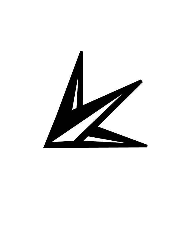
Here is my latest development from your feedback and trying to simply and be less obvious.
Any thoughts?
I'm digging what this carries at the moment...obviously needs to be put in some sort of context...but I'm liking. It also seems to be point downward...which probably isn't a good thing.
MORE MORE MORE!
Paul
---------
Design Studio Melbourne
In context:
Helvetica is there because that is what the client wanted but I am going to look for something else yet similar.
Now you're really getting somewhere!
It's close but really not the same. This is a star and elements of a compass. I'm comfortable with the similarity.
I have to admit I didn't see the arrow until ratbaggy said it was pointing down.

> I'm comfortable with the similarity.
It's your call. In any case do make sure you know the story behind that logo. It was designed by one logo designer for another, and latter happened to be a fraud and made a big fuss when he got caught. I am sure the ripples from that incident will eventually subside, but there is still a plenty of people in the logo design community who react nervously to that logo. This is in part why I remembered the logo in the first place.
By the way, that's a very nice type. It's like rounded Akzidenz. It's not Alte Haas by any chance, is it?
I tried to read up on the story but I'm not sure exactly what happened. From what I understand, the logo was used by a designer that would steal stock art and make logos from them. Is that the story?
I had never seen that logo until you showed me. Is mine that similar? The lines are not at 90 degrees nor is there an inner arrow. Those are 3 pieces of a compass rose that I illustrated myself, inspired by the art shared by "ishbog" above.
Yes the type is Alte Haas. I love the rounded corners so much. There is a company called Fido that does all of their promotional pieces with this style of type. I'm not sure if it is Alte Haas exactly.
Can you suggest a type like this one that is bit more unique?

I think it's fairly distinct enough to not conjure association with Relevant. The comparison didn't cross my mind until it was brought up, and I think the audience and industry this is for is separated enough that 98% of people who see it won't make the association either.

I wouldn't worry about comparing it to logomotive's mark.
I really like where this logo is going.
Given the angularity of the mark and the point it makes, I think modifying the face to have sharp corners might be something to explore.
can also see this being built as a kind of abstract 3d model too...
infact, maybe that would give it a nice point of difference, just a different view of the compass points i.e, 3/4 front view.
or wait... A CROWN!
> Can you suggest a type like this one that is bit more unique?
Perhaps have a look at Mentone? Alternatively, and I realize it's a heresy, you can take any font and simply add a stroke around it with rounded joints.
BTW I know of Fido and I really really like their slightly rounded font. I am too not sure if it's Alte Haas. It looks like it, but given the size of Fido I think they are more likely to commission the replica than to use an (effectively) abandoned font.
(edit)
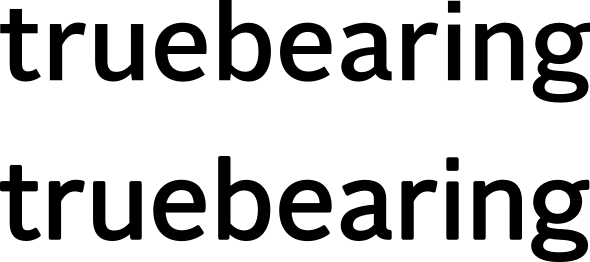
Here's what I meant by adding a stroke to round the type. Top is Alright Sans Medium, bottom is Alright Sans Regular padded with stroke with rounded corners. You can see some distortion in letterforms, especially in /r/ and /e/, but it is not that bad.
Given the angularity of the mark and the point it makes, I think modifying the face to have sharp corners might be something to explore.
I second that.
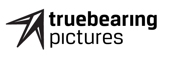
Back from the grave...I've found a typeface (breuer) that I am happy with although once I buy it, I plan on changing the angle of the ascenders on the "t" and "b" to match the angle of the mark. I'm just not sure which weight is best so I ask for your two cents.
Bold/Regular
Medium/Light
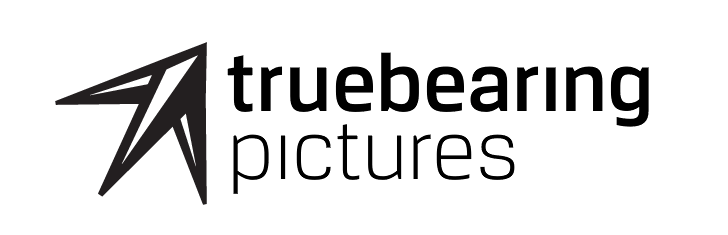
Right now I feel that Medium/Light matches the mark best.
Captured from web.archive.org on 11 Oct 2013. view this capture

