Typophile

Work in progress

Robert K.

Haven't been here awhile.

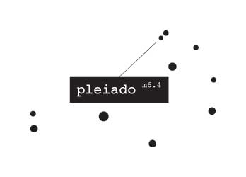
This is the very beginning of a new logo. It has started on a piece of paper and this is the first digitized draft (and just a draft). I'm deliberately not providing any additional info on the logo, because I would like to hear from your:

  • critique of this draft
  • associations/emotions you get by looking at it
  • what came to your mind when you first saw it
  • what industry you think could be suitable for
  • what other ideas may popped up your mind
  • any suggestions you may have

Thank you very much.

  • type seems pretty static
  • kinda restricted fun
  • Chemicals
  • Chemistry/Lab
  • bubbles
  • can't really make suggestions without knowing what it's for eh ;)


Paul
----------
Design Studio Melbourne

I'll provide additional info after I get few more opinions to make them a bit more measurable. Thanks for your input Paul. Always appreciated.

.

@Jennifer: Does that mean nothing pops to my mind?

The bubbles appear too crowded at the bottom (and maybe too near the wordmark), or, at least, the rhythm seems broken.
Too many colours for a draft.
It will be difficult to place other elements around the logo.

Bubbles, water, aquatic sea creatures? Pharmaceuticals? The Pleiades are a group of stars, so maybe aerospace?

The colours make me think it could be something for children? Also Pleiado sounds like Play-Doh.

I think I'd make the blue and pink bubbles smaller.

>kinda restricted fun

I agree. The bubbles look quite deliberately placed.

Looks like I'm a bit off. But the thing is when I look at logos from various companies they don't always tell you directly what the company/business is about. So first of all:

  • this logo is for a company that's primarily in agile software development business but a part of it also in graphic design; that's why all the colors.
  • Pleiado is derived out of Pleiades, seven stars, that are also related to similar minded group of people, which relates to team software development.
  • circles represented as bubbles are just part of this draft; they may be replaced with anything; stars as well...
  • bubbles start on top of the "i" to replace the dot on it.
  • bubbles overlap to give a sense of dimension
  • lifting shapes (in draft's case bubbles) give a sense of lightness that I can easily relate to Agile principles

@Bendy: I agree I could place bubbles (shapes) more sporadically to not pose an exact shape and make them more playful

@ricardo: I thought to deliberately overlap shapes in the final version (possibly with a hint of transparency) to relate logo to visual aspect of company's business (graphic desing).

@everyone I definitely didn't intend to relate this logo to pharmaceutical industry. The thing is I don't know how to relate agile software development with visual elements. I don't have a workable idea. Except growing/composing shapes/sizes/weights... but that's just growth. No agile-ness in it.

I still want to make this logo professional but not bound to square/round shape.

I thought I could place lifting smoke over type... It would make my logo design a bigger challenge (think of Silverlight logo), especially because I MUST make it work in BW as well.

Now that you know much more, would you change your opinion or suggest new things or give some additional observations and directions? Please do.

Thank you very much and I hope you will all (at least the ones that did so far) reply again.

I don't have a clue what agile software entails, but I think the concept could work. This kind of logo works really well as it defines a palette that can be used on all different communications.

Agile seems to include the idea of quick movement so give the bubbles/stars a bit more freedom. I'd lose the gradient fills and be really selective about the colours used. If you could invent a shape instead of bubbles or stars, that could be used on its own as a mark for other things. And don't you need seven bubbles to fit the reference properly?

@Bendy: Yes seven. In the way that these circles/bubbles are positioned now, seven would be too many, that's why I excluded one. But by placing them in a more random fashion I'll be able to put all seven of them.

Seven was one of the main ideas to use in this logo. But my doodles with it were not useful.

@Robert
Sorry, Didn't have time to respond but wanted to follow the this thread.
Nice color, I too thought pharma company but get it could be software too. Why not 7 bubbles for the seven stars?

The thing is I don't know how to relate agile software development with visual elements.

I can tell you as a professional computer programmer - "agile software development" is a marketing speak of a fad variety. Meaning that the logo needs to work for the marketing people in the first place. It needs to be "cool and hip", but other than that it can be anything.

Keep the logo agile then...redrawing (potential) connecting lines between the stars depending on the usage.

the m6.4 is the magnitude of a particular star.

Bit of a start anyway.

Software...ology.

 
----------
Paul
Design Studio Melbourne

@ratbaggy: I didn't really get that part with connecting lines depending on the usage as well as using magnitudes... Otherwise your idea is visually more in direction that I'd like to take. Breaking the box of rigid logo that's encapsulated inside a visual square-ish box. Your constellation breaks it. You can't visually put it in a box.

Don't you think that using direct constellation positions would imply on astronomy related business? I could of course position these "stars" in any way I would like.

yeah the 'agile' nature relates to flexibility, so it seems like a perfect oppotunity to create something that is dynamic in its delivery, i.e, the overall concept and mark don't change, but the lines can connect any number of stars or point to one star, it's flexible without changing.

As random dots, they don't even have to be stars. Adding the m6.4 bit just brought some more scientific bent to the overll feel. Original thought after you mentioned stars was the softwareology, which could either be cheesy or effective. Ology = A combining form meaning "the science or study of".

I literally threw it together in a minute, more as a "could be something more in this" rather than "here's a fleshed out concept".

----------
Paul
Design Studio Melbourne

I like Ratbaggy's logo. It looks brainy, scientific and programmery. It's memorable and just needs some decent colors.

it'd also translate to a website pretty well.

and other printed collateral ... thinked screen printed plastic with holes punched.

invoice is in the mail ;-)

Or... To relate the logo with graphic design as well I could use exact locations of pleaides constellation but use simple ink splatters. That could be really great. I'll make a draft of that. Seems like a good combination of both worlds.

A pleasing dainty design suggesting cleanliness, hygiene, healthy living. As a logo the bubbles will appear too small on a monitor screen if it is greatly reduced...perhaps less white margin will solve this. Do you know 7-up? I counted the bubbles and there were six..reminded me of a silly old joke about 7-up. An entrepreneur markets a drink called 4-up but it fails, then one called 5-up , it fails, 6-up also fails so he gives up... and the punchline is "He never knew how near he got!". I hope your logo succeeds.

@Vladimir: I don't know which 7up logo image you looked at, because there are quite a few of them. Some of them have lots of bubbles, but the one you're talking about is probably the one that has 7up written on a huge bubble and 6 small around them. So there are actually 7 of them. ;)

Does NOT want to see ink splatters!

heh.

Didn't see if someone mentioned this but as far as the name...there's a potential for mispronunciation and confusion.

@evanbrog: Can you provide some more info about your statement? The thing is that this company is not in an English speaking territory. But just the same. It's still going to be miswritten if not mispronounced. But I'm interested in what way do you think is problematic?

Well perhaps in the native country things should just be fine.

But for me, the question is in the middle vowels. Obviously there's at least 2 ways to stress each vowel and there's three vowels in a row, which makes for a lot of possible combinations of how to pronounce the name.

Now I don't expect you to be changing the name, but I also don't know how set in stone it is. My particular concern was that your audience can't say the name correctly. Personally, I would always want them to "get it" right away, just the same as I don't like people mispronouncing my own name.

But for the business, is it detrimental? Will people be likely to remember the name if they aren't sure of which way to pronounce it in the first place? Same goes for a recommendation of your business--will the person who is told, "Play-ee-ah-do," (or whatever) "does great work, you should go with them." Will they remember?

Perhaps it's wont affect leads--that would be based on your business model and how and where you approach your marketing.

So litera I'm curious what you think, and if it's not a problem why--it's always fun for me to think through things and learn something in the process.

@evanbrog: This company has been up and running since last summer. It's not a standard-as-you-know-em company, but rather works with individual clients on a case-by-case one-by-one basis. Company name isn't really a brand and it probably never will be. So the name isn't a problem in this regard, if you ask me. I do agree that this name is very well chosen, but I could be wrong. If there's going to be an end product of some sort from this company, it's going to bear its own brand.

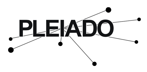
I've avoided using splatters but positioned seven shapes allaround the name. So here's #2:

-
And maybe. Just maybe. This is very development oriented version because it represents a self closing XML tag. I'm not so sure if it could be used as a logo, because it may be too generic and straightforward. So here's #3:

I see 8 O's. =)

The 6 shapes, the tittle, and the O in pleiado.

@evanbrog: These curcles aren't derived from the letter "o". If I'd make them more round, they probably wouldn't complement type very well. And in this version the logo is pure BW. In colour version those circles would probably be more colourful and non-hollow.

Re: #3 - I have most certainly seen this exact concept used by some web development studio for their logo.

I think you are closest with #2. How about taking one of the circles and making it big enough to go behind the "ple" (half way behind the e)?

I like the revised b/w version with the bubbly stars. Did you already try playing with the "o" to add it to the constellation? Maybe too much, but just a thought.

Hi - the 7up I remember is from my university days way back in the last century it had a red label on a green bottle with seven bubbles. Anyway if you image google Pleiades you will see photos of the constellation perhaps that will give you some ideas. By the way the Pleiades are really beautiful stars and visible with the naked eye on a good clear night. With a telescope they look like this
http://pessimisticidealist.files.wordpress.com/2009/04/pleiades_gendler_...

With a telescope they look like this

They seem to form a nice arrow shape.
Could be a good visual clue for [agile] development.

@ricard0: If you stretch your imagination you can see Pleiades as an arrow... Look up in the sky. They don't really look as an arrow at all. If it was Andromeda... Then I wouldn't argue. On Vladimir's link the do look like an arrow but they don't look like that to naked eye, because light is excessively emphasized on the image. Rather look at Ratbaggy's version of the logo that shows the constellation in more natural look and feel. I don't really see an arrow there.

But I would probably rather avoid using exact constellation positions, to separate the logo from astronomy, because the company has nothing to do with it. I tend to use number 7 and keep the logo open and unboxed... In some way or another. Stretching the limits. Anyway.

I will have to somehow replace those circles-wanna-be's with something else for them to not look as bubbles.

@litera I agree that in the sky the stars look like a brilliant bracelet not at all like an arrow. By the way why do you need to combine the logo with the name why not a separate graphic logo? The Pleiades photo shows cross-like diffraction pattern artifacts over each star, maybe extending those in an abstract way you get a sort of techno-graph look suitable for software.

Putting a symbol separate from type would do something I would like to avoid. It would separate the whole logo in two parts. Probably making the whole logo visually contained inside a square-ish box. Keeping them separate leaves the whole logo more free an un-boxed. Basically agile development is about adaptability of the process and product functionality. So it's rather free but still connected to the whole end product.

The other idea I'm also willing to get across is the design aspect of the business. Design as an art is also rather free and unlimited.

These two are the main reasons why I'd like to have a bit different logo.

EVERYBODY:
Does anyone know of any logo with a symbol and type that are not put inside a certain box? SO symbol is all around type and vice-a-versa...? I would be more than glad to check those out and how they work as a logo.

@apankrat: was it the CodeFish (http://logofaves.com/2009/08/code-fish/) logo that reminded you of my #3?

No, it was something in the form of an HTML/XML tag - opening bracket, name, slash, closing bracket, i.e. exactly like yours except for the name. It was at least a year ago and I saw it in one of the web design galleries rather than on a logo-related site.

If they are separate then you have the choice either of showing the design alone, like the Apple logo, or together with the lettering next to it. That was the reason I mentioned the possibility.

apankrat, I remember seeing that too, it was very very similar.

If they are separate then you have the choice either of showing the design alone, like the Apple logo, or together with the lettering next to it. That was the reason I mentioned the possibility.

Definitely like the < /> end tag. DEFINITELY gives a LOT more meaning to the logo, and I think it would communicate decently with the audience (people needing programming).

You should consider involving vertical or horizontal lines to produce a more cutting edge or straightforward feel. I whipped up a little thing relating more to the stars just as a sketch:

This is something completely off past versions and styles, but it is something. It combines 7, geometrics and artistics...

Just doodling but I thought I might show it to you...

Seven elements with seven corners. And you've probably guessed where hand is taken from...

... or not... Anyway. This hand is stylised from Rembrand's The night watch.

I'm not too sure.

There could totally be something in this direction. My initial reaction was "it feels like a game of chance".

So...to that end, if the concept were to work (in my opinion) there would need to be a feeling of 'control' or 'organisation'...without feeling like a magician (I don't think juggler is the right way to go, too fun?).

More geometric shapes/arrangement would help with this 'organisation'.

Thanks Ratbaggy. Exactly the kind of comment I needed. I felt the same but couldn0t define the vague feeling inside of me. Cheers.

Pedantic geek issue:

<pleadido />

in XML, when set as a self-closing tag = pleadido is empty and contains no value.

Not sure if that's a good connotation.

But perhaps you could play with it:

<pleadido>awesome talent</pleadido>

More as a tagline.

That said, the 'bracketed code to imply this is a dev firm' has been used quite a bit in the past and may be overly cliche.

Well I could as well convert it to server script bound to Asp.net. Which is exactly the platform that company provides development on.

<%= pleiado %>

but this makes it a bit more complicated as a logo...

^ nah. It makes the logo look as if it was designed by a programmer :)

I'm still puzzled with this logo. I just can't seem to decide what should I use. On one hand I like the logo that is boundless, but the problem it has is that it doesn't have a symbol. It always has to be together with type.

On the other hand I like a single symbol, that doesn't require type, but I can't seem to find something useful that would be mainly related to development. And I don't want to use any cliches (like monitor, key from a keyboard, globe with a swoosh etc. that are mainly used with IP development companies).

I don't know what would be clever.

I'm still leaning toward logo with circles (wannabe) around type, but I don't know if using circles is ok. They seem too basic. Sharp stars are not style compatible... I also have a great idea about business cards. type would be printed but circles around it would be punched out. Which would make for an unusual and interesting effect.

The only thing I'm sure of is type. I'd very much like the versatile style of PF Square Sans Pro...

Anyway. Here's one more new path I took...

I know you may say that it reminds you of Mont Blanck... But I use seven stars on a squarish circle... Thinking of it... Just because of this fact it was probably a total waste of time...

Maybe this logo has gone backwards.

I liked the 11th of March direction with the seven shapes.

I like the last iteration. But the symbol need to be placed as far away from the o as possible.

PLAY-DOO

I started working from scratch. Paper, pencil... I'm preety sure that those dots don't work as expected anymore. I'm not really sure. I kinda don't like them, because they ALWAYS need wordmark as well.

(Those 111 mean 7 in binary)
(Those squares wanna-be's are negative 111)
(Others mainly doodles...)

Definitely not the pd ones (1st column 3rd and 4th down).

The dotted ones are not working for me either. I think dots need to form a meaningful shape for them to be usable without a wordmark. Perhaps try building a P out of them?

I really like 4th down in 4th column. If it was meant to be a take on @, then it's spot on. Very Internet-ish.

Another observation, may or may not be helpful - there are seven letters in the name.

The idea with binary notation is probably going to be lost on a vast majority of viewers, programmers included. I would've not deciphered it, and I am a Comp Sci major. There is however something in the idea. Perhaps use 7 somethings in a row and shade 3 last of them differently? Though in this case 8 somethings would make more sense...

I kinda like the "p" as @. It was meant to be similar to @ yes. And the other ones with similar shape represent a 7 with rounded shape around it (we write strike through 7 here in our country) so it's a 7 with circle around it that makes a shape of P.

Anyway. These @-like signs have to be tweaked to complement the style and shape of letters. thanks for your comment @apankrat.

Ok. These are digitised versions of what I've been drawing on paper. The three ones I liked the most and found most interesting. Anyway. Here they are in type matching style:

_________________________
P as @:


_________________________
Ones:

_________________________
7 + P:

_________________________
A new digital P (unsketched):

_________________________
I must as well say that I'm sorry for posting so many indecisive versions of the logo. The main problem that I'm having is originality. The one with scattered dots/circles is not really useful as a logo I guess (because it doesn't really have a symbol even though there's graphic used in it). And I haven't found a good logo with similar approach that is clever and I could say: "ok this is the way to go."

I couldn't really decide whether I should show this one or not, but here it is now. I've obviously made the decision. ;)

P as @.

P as @.

hi, sorry for my english but i follow your work since sky lark (beautifull logo!!) and this time your logo is missing some story, some emotion side. I dont know why you show us the first logo. I think you did it because is the best one. Try to rework details with the first one. Maybe if this is a farmaceutical logo, the 3° logo is a very good option.
I hope you undersatnd my poor english.
bonne chance

Sorry I want say the #2 logo and not 3°

I must say (having spent most of my creative career as a pen-and-paper designer,) that I find this modern way of sharing and working online interesting and yet strange. OK do not mind me, but so far I like the digital P (unsketched) the best - it is slightly derivative from the XP logo concept of dots, but it is original enough, and has a dynamic energy, shows the stars in a stylized fashion, and is related to computers because of the digital aspect of full and empty pixels.

@paluro: I don't really know which one is #2 or 3°? I know which ones are "P as @", "Ones" etc... as I've labelled them... If non of them are, please refer to my designs with post time-stamp displayed.

@Vladimir: I don't know to which XP logo are you referring. Can you provide a link to it?

I'm guessing Vladimir meant old Xerox logo.

@apankrat: Could be. Thanks for the link.

Here's a colour version of the last logo that I kinda like even though all it has is a "7". That's the most relation to Pleiades as I can think of with this symbol. This symbol is as close to type style as I can make it. So instead of making pure square I've rounded it, also making some vague relation to a computer monitor (duh)...

with some zoomed-in detail:

I must admit (against much liking from you guys) that my version of "P as @" is not really working, because it seems too busy. Maybe it would work if the curve around "p" would be a bit bigger so it wouldn't be too close to the letter, but unfortunately it would be quite hard to make the connection with it on the left side and still keeping it symmetric on the right side...

This last one, while good, says to me more TV network than programming venue.

@Vladimir: I don't know to which XP logo are you referring.
@I'm guessing Vladimir meant old Xerox logo.

It is an old Windows logo - sorry it may not have been XP but Win 98! Here it is
http://img474.imageshack.us/img474/1825/windows98od1.jpg

This is for me #2

free elements an geometrical shapes are dinamic for this subjet.
Tha last logo work in your post of "13.Apr.2010 3.38pm" I like it too,
very good work but"seven" is it so important to communicate?
Good work
paluro

PD:do you work inparing the concept with key word "soft"

@paluro: Seven is just as important as those seven shapes/bubbles are. Basically they're not important. Number seven relates to Pleiades greek mythology or broader meaning of pleiades (seven equally minded people)... So seven (in any way shape or form) is just a symbol that's related to pleiades.

The thing I don't understand in your post is: "do you work inparing the concept with key word "soft"". Can you elaborate a bit on this as well?

Ok. This is slowly getting to the point when I become fed up with it and stop working on it for a while. To popular demand I've made a usable version of the logo P as @.

I've tried putting type lower (a bit further away from the symbol), but they looked too disconnected. Anyway. I realised that I don't like this logo too much because I may have a problem with the local mobile provider Mobitel with this logo (brilliant in my opinion). It's not that company businesses compete for the same market, but this logo has a very strong brand...

And while looking at this latter logo I can only realise what a bad job I've done with my logo. :( Too busy... too much info... not memorable... I think that "7" logo is stronger in this regard.

I like the way the "p" and the "i" merge in a figure and ground manner in that last one.

Anyway folks. For the time being the Seven Pleiado logo is what's used. For now. Until I get a breakthrough idea that would make it more software development and design with a twist... ;)

"p as @" was way too busy, the "scattered logo" didn't actually work as a logo without an actual symbol. Those scattered dots were merely logo background.

So that's it...

...for now...

again, I'd love to have over a month to develop a logo.

what are you guys doing that I'm clearly missing?

@Ratbaggy: I'm not sure I understand what you're asking? Would you like to say that:

  • you always have to finish a logo in much less than a month or
  • you're never able to finish a logo in less than few months...

If your problem is the first one, than you'll have to convince your customers that a long-to-be-used-logo is a complex process that can't be done in a few sketches and digitised in a week. On some rare lightning-strikes occasions when you get a really great idea in the first second and also execute it perfectly.

In my case, meetings usually stretch on a longer time scale so even with a great idea I wouldn't be able to finish it in less than a month. Usually.

I don't really know how to charge people for "conceptualizing" as a freelancer. Can I get your advice?

Are you charging your client per hour for all the time you brainstorm? How many hours are you up to now and how do you justify it to your client if they question it?

#2 all the way.

This word is floating amongst the stars. It's engaging, deep, and meaningful.

http://typophile.com/files/logo%20copy_3902.jpg

I disagree entirely with the notion that the stars are merely a background to the logo. They ARE the logo.

Refer to the Bahamas logo:
http://sublimedesign.files.wordpress.com/2008/07/bahamas.png

I know this is a little late, but I really feel that this direction is the strongest and most interesting. The stars only need to be stronger.

Captured from web.archive.org on 18 Aug 2013. view this capture