
Another in my series of eccentric White Center (Seattle) signs made by merchants whose first language most likely isn't English. This made me laugh.
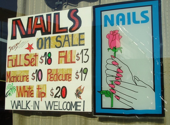
Funny how the first 4 letters in NAILS (left sign) are razor-sharp, but the writer went free-form with the S after presumably giving up on a ruler-based letter.
The rest of the text is wildly mixed cases, sizes and spacing.
Then the artist added hand-drawn palm trees, flower and butterfly to complete its beauty and fill in the disturbing white spaces. Maybe his wife told him it wasn't pretty enough to appeal to women customers.
Obviously the sign on the right was composed by a different designer, who used an actual font (of questionable suitability), margins, a border and illustration, again with an eccentric result.
the two signs together - well how could any passer-by in need of nail attention resist?


