
A fresh, clean Slab that plays in the space between the Typewriter and the Storybook. I'm shooting for something highly sophisticated, and I'm very detailed in my approach; so please give me as in-depth a critique as you are able.
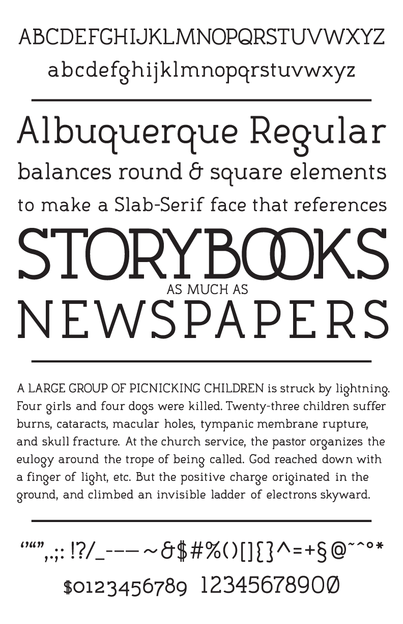
I don't mean to nag, but I know there are a lot of really talented fontographers here. And I know that they occasionally apply their expertise toward constructive advice... And I've tried to be a part of this community, writing several lengthy critiques of others' work. So, what I'm asking is: I can has critique now please?


