
Good evening fellow typophiles,
My name is Paul Cooley, I am third year student of Graphic Design at OTIS College of Art and Design. I have recently delved into the world of type design and am absolutely in love. The typeface below is an attempt to combine the languages of Geometric and humanist sans serif typefaces, especially focusing on attributes of Gill Sans, Futura, Akzidenz Grotesk, and Helvetica. I wanted to treat this as a sort of "dream team" of different attributes that I feel work the best in these examples and try and synthesize them into one cohesive face.
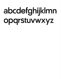
Right now there is only the lowercase characters which I will continue to focus on in the coming weeks and months. There are some proportion and unity issues and some characters (e, g,s,t,x,z) are proving to be challenging. Regardless, this is an exciting learning process that I hope will improve my abilities.
This is after a few months of work and research and is still in the developmental phase...so nothing is permanent. In other words feel free to throw out any ideas or criticisms. Also, If their are any faces that you would recommend I look at...please let me know, I interested in casting my net as broad as possible.
A full-size pdf is at the bottom...thanks!
| Attachment | Size |
|---|---|
| plainlowercase.pdf | 7.57 KB |

