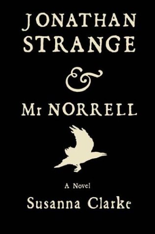
Finally got around to reading "Jonathan Strange & Mr. Norrell," set toward the end of the 1700s. The cover is fun, but inside is really interesting...the whole book is set in Baskerville —and unusually, an entire page at the end is dedicated to one small sentence naming the typeface.
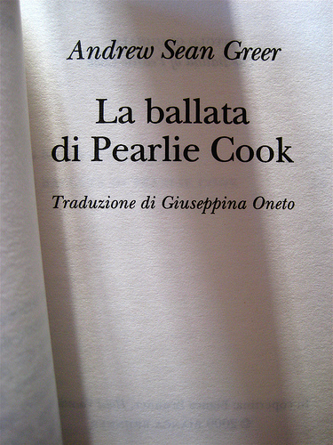
I loved it's hearty color, the way it seemed born to embody the story's visual voice, and fit so snugly with the setting, mood, syntax, etc... Cut to this week—I tested a version of Baskerville I happened to have, and was utterly appalled. Horrible, useless stuff. Blech.
I guess I'm curious as to what digital cuts or interpretations of Baskerville have good color, which feel right or have gorgeous swashes, etc, and which in the end just don't work?
Is it really because so many digital Baskervilles strive for a fidelity to the matrices over anything else, and don't take into account real-world conditions like ink spread — and just end up so light and anemic-looking on the digital page? What versions don't suck with today's incredibly-refined, razor-sharp print technology?
From Baskerville in his own words, in his foreword to Milton's Paradise Lost: “Amongst the several mechanic Arts that have engaged my attention, there is no one which I have pursued with so much steadiness and pleasure, as that of Letter-Founding. Having been an early admirer of the beauty of Letters, I became insensibly desirous of contributing to the perfection of them. I formed to my self Ideas of greater accuracy than had yet appeared, and have endeavoured to produce a Sett of Types according to what I conceive to be their true proportion. … It is not my desire to print many books: but such only, as are books of Consequence, of intrinsic merit, or established Reputation, and to which the public may be pleased to see in an elegant dress, and to purchase at such price, as will repay the extraordinary care and expense that must necessarily be bestowed upon them.”
::::::::::::::::::
"There’s also a wonderful chapter on John Baskerville and the many versions of his typeface in Simon Loxley’s Type: The Secret History of Letters; particularly take note of his comments on Fry’s Baskerville, 'a piece of 18th century intellectual piracy'"
"RIT’s Archibald Provan — one of the greatest typography professors in the known world — confesses to wanting to be reincarnated as a font of 72-pt Frys Baskerville. True story."