
I'm looking for a good extended serif typeface to be used on a wine label. Here is an example of what I'm looking for: http://streetbush.com/ExampleofExtendedSerif.jpg

It DOESN'T have to be exact:
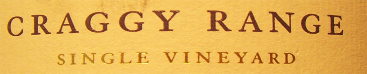
I'm looking for a good extended serif typeface to be used on a wine label. Here is an example of what I'm looking for: http://streetbush.com/ExampleofExtendedSerif.jpg
It DOESN'T have to be exact:

I'd say it's ITC Garamond, extended artificially.
- Lex
I'm told that extending fonts artificially is a bad call. Do you recommend a certain way to do it?
Example: Bring it into illustrator > convert to outlines etc. ? or just use free-transform in PS and drag it out sideways?

You could try Aviano Serif for an extended Serif.
You're right about artificially extending fonts. A good rule of thumb is to include a picture of a face (preferably yours) and scale it along with the font. As long as the face doesn't look distorted, you're probably OK. Usually you can scale between 95 - 105% without it being too noticeable.
I can't really think of too many extended serifs. You might want to try Engravers Roman, Americana, Newtext, or even Copperplate Gothic, although none of them look like your sample. If you want to go for a slab serif, Hellenic Wide could do the trick. Also, Black/Extra Bold weights of serif fonts tend to be wider than their regular counterparts.
- Lex
Luxury Diamond is worth a look, too.
Good call Lex, I'm a sucker for slab-serif typefaces… It may be a nice route to explore. I'll probably have do at least 50 comps to see what works.
Hey Renko, Thanks for posting those suggestions, I always appreciate as much feedback possible in these forums.
I definitely have a lot to work with.
Still, if y'all come across any Extended Old Style or Extended Traditional Serif typefaces, I'd much appreciate it!
You know that you can combine your target words in the font search?
I was aware of this, but I'm still having trouble finding extended serif typefaces that don't come to a sharp point.
It's even harder to find an elegant slab-serif extended that belongs on a wine label. Thus, I'm sticking to traditional and old-style serifs.
I've always liked Craw Modern though of course it tends to make things look a bit retro in a 50s Frank Sinatra LP kind of way.
Nice, It feels like clarendon with that lowercase "a"
If you come across any others, I'd be very grateful. Already, everyone has been putting up great ideas. Thanks :)

Have you looked at De Soto?
Wow, that is really nice. This brings me a lot closer. I'm getting to the point where I'm just going to convert a bunch of typefaces to outlines in illustrator and modify them 'till I land on the proper look.
Thank you guys for the help so far…
I'll just note that artificially extending a typeface is generally less horrific than artificially condensing. The reason being the thick-to-thin balance. Optically, higher contrast between verticals (thicks) and horizontals (thins) is usually okay, but reversing that contrast is a Bad Thing.
While I don't like to squish or stretch type at all, my rule of thumb would be more like 95%-120% is the reasonably safe range.
The other special problem is the letter "S," which just does not survive such manipulations very well. Depends a bit on the typeface, but....
T

How about No Bodoni's Nirvanium?
- Mike Yanega
Captured from web.archive.org on 22 Mar 2015. view this capture