Typophile

Need alternative to Courier and complementary sans

tylor.reimer

I'm working on an annual report for school and have been using Sabon Next and Courier so far. I like the feel of Courier but it's set width is pretty wide. I was wondering if there was a typeface with a similar feel that doesn't set as wide. It doesn't have to be a monoface.

Also I'm curious if you guys have any suggestions for a third typeface (a sans-serif) that may complement the two.

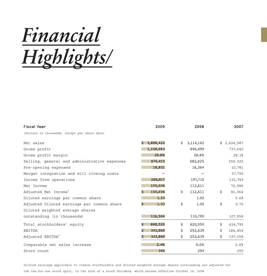
Being somewhat wide it's characteristic of monospaced typefaces.
The most known proportional typeface with a typewriter look is American Typewriter, which comes with a condensed style as well (http://new.myfonts.com/fonts/adobe/itc-american-typewriter/cond/).
But there are plenty that share a similar look:
http://new.myfonts.com/search/typewriter/

I like the unchanging line widths of Courier (gives it a very technical quality). Unfortunately American Typewriter does not share that same quality.

Here is what I have thus far. Any suggestions are welcome and appreciated.

Andale Mono is my favorite monospaced font. It's not so much a complement to what you're already using, but it could be used in place of Courier. It's one of the MS core web fonts so you should have it. It's a sans-serif, and a bit narrower than Courier, so it has more of a coding than typewritery feel to it, and I don't see it used all that often compared to other such system fonts.

You also may want to remove the underline from "Financial Highlights".

Captured from web.archive.org on 12 Oct 2014. view this capture