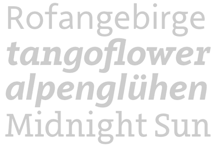
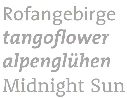
We are proud to present the latest typeface project of Ingo Preuß, the Arventa system.
The Arventa typeface system is available in two families, that complete each other in a pleasant way, the Sans and the Slab family. Arventa Sans was the basis for the system, but the Slab is not just a Sans with sticking Serifs. Arventa Slab is delicately crafted form the outlines of the Sans. The Arventa design is a mixture of geometric and humanistic forms and elements to serve the demands of higher legibility. When it comes to classic, constantly, high legible forms, both Arventa designs are a perfect match.
Every Arventa family offers seven weights (Thin, Light, Regular, Medium, Bold, Black & UltraBlack) including the Italics. Every single font spans a glyph range of over 1000 letters, reliable developed after the GTF-UNI-Standard. Every font supports extended Latin, Cyrillic and Greek alphabets, small caps, various numerals (tabular and proportional), scientific numerals, fractions – all accessible by common OpenType features.
The Arventa typeface system provides all you need to do great typography.
http://www.germantype.com/arventa
http://issuu.com/preusstype/docs/gtf_arventa_02