Hi everyone,
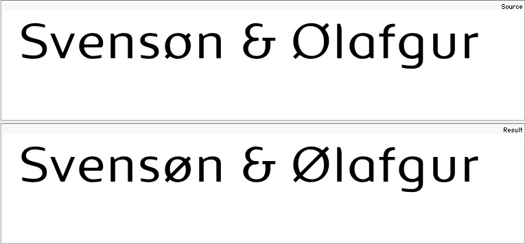
in my current font (Brevier Ten) Ø and ø bar does not extend through the center counter of the O, o instead it only extends from the outer portions of the letter.
A bar through the center would certainly be more legible but with a broken bar texture/color would be way better and I think it would match the overall type design better, too (similar thing going on with $ and ¢).
Since Brevier Ten is a typeface for body copy, question is if those broken bars are too hard to read or acceptable.
What do Danish and Norwegian readers think about that? :)