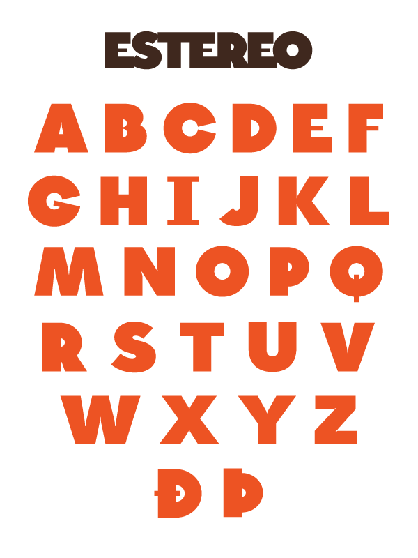
Attached is a first stab at a display typeface I'm putting together called Estereo. A few notes:
1) It's meant to be quirky, hence the odd pairing of mostly heavy strokes with the occasional light ones.
2) There won't be a lowercase set. Lowercase glyph positions will be reserved for a number of uppercase alternates and ornaments.
3) I'm looking for critiques in particular with respect to stroke weight across characters; for instance, it's pretty safe to say that the A and the X are not of the same weight and need to be fixed.
4) I don't think the S is quite finished yet.
Any additional feedback before I move forward would be excellent. Thanks!
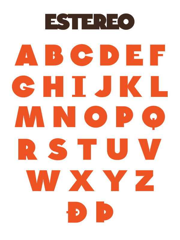
| Attachment | Size |
|---|---|
| amv_estereo_preview_0.png | 27.25 KB |