
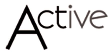
Does anyone know what font was used for this?
Thanks in advance. Ü
Does anyone know what font was used for this?
Thanks in advance. Ü

Kabel
Really close, but not quite... Kabel's lowercase e's too tilted.
Hmmm... anyone else? Ü

The ‘e’ looks rotated.

Being it a logo, as it seems, tilting a letter would be the least modification to any font. Moreso if you see that (to me not so beautiful) e wouldn't work at that angle inside a word.
Captured from web.archive.org on 23 Jun 2012. view this capture