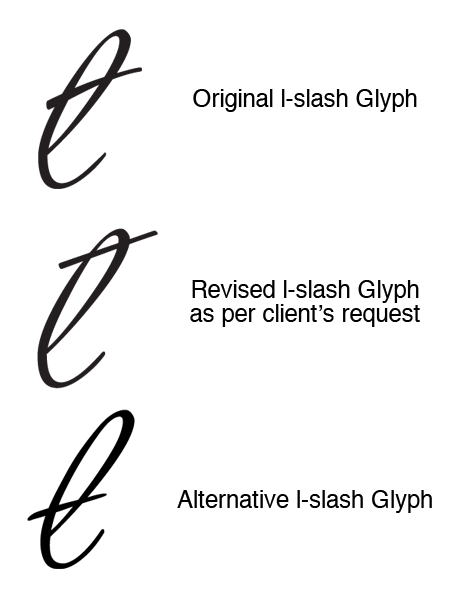
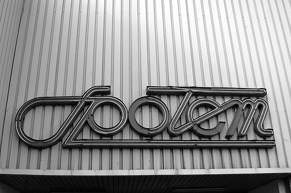
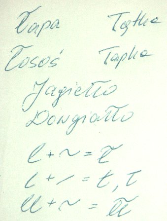
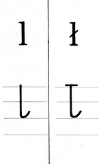
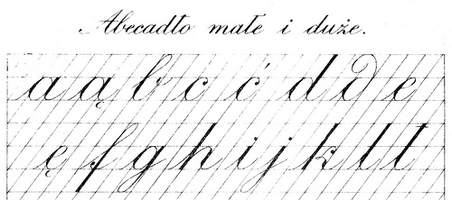
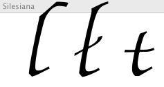
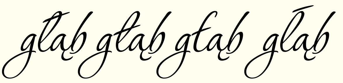
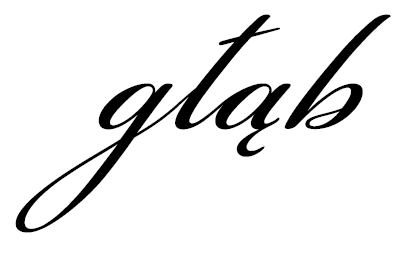
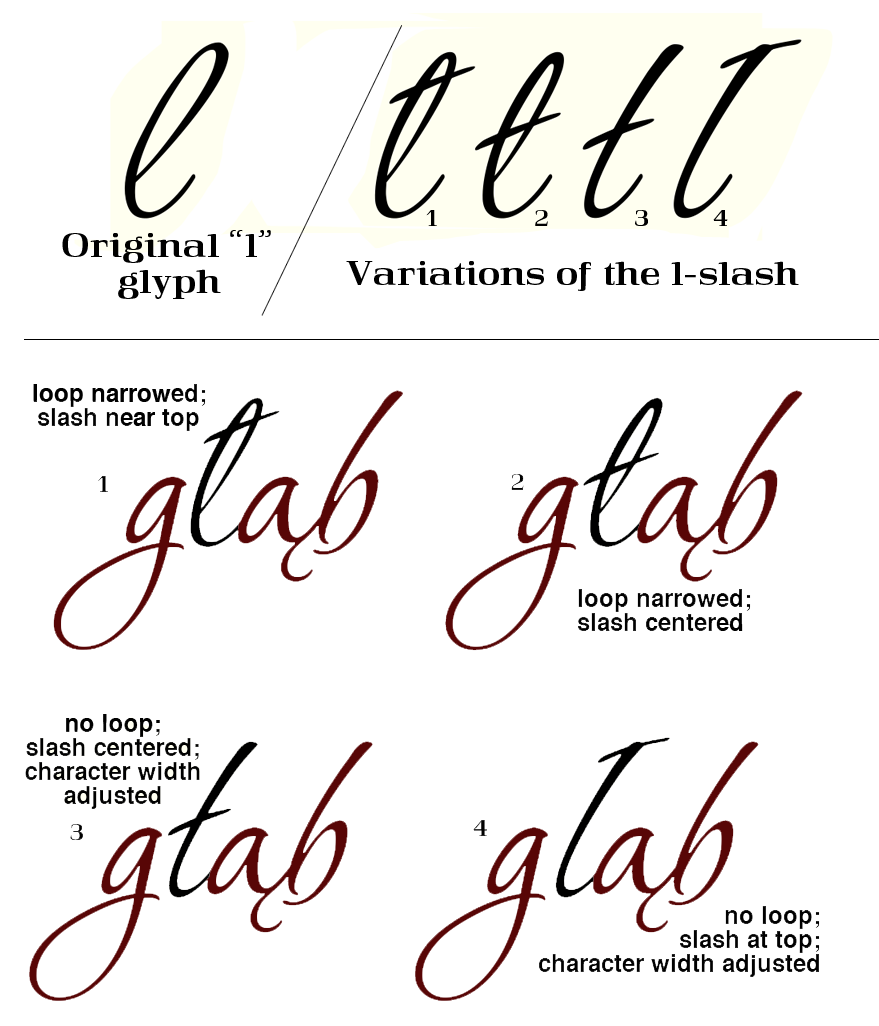
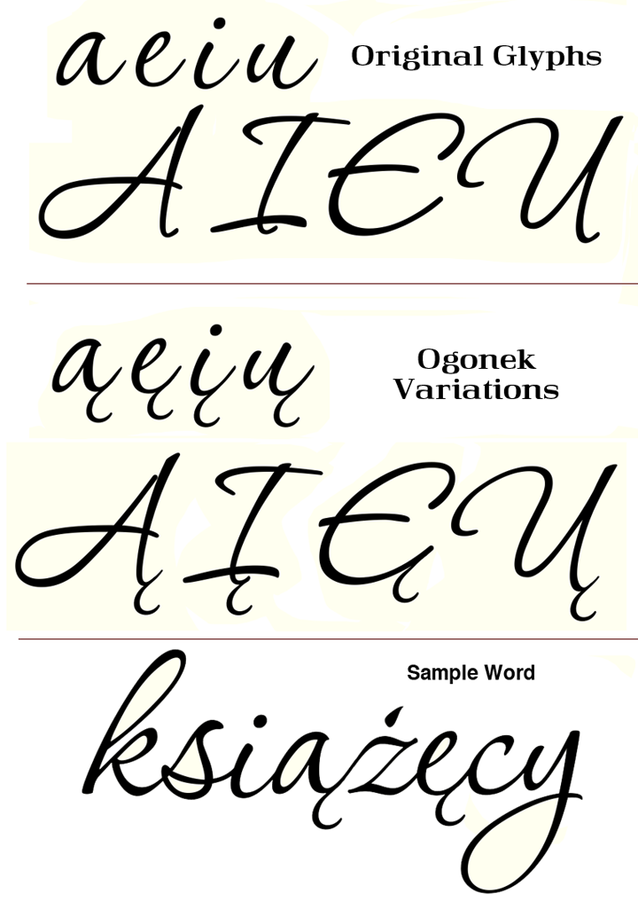
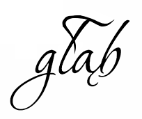
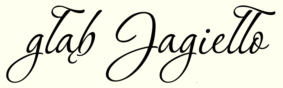
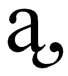
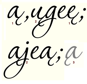
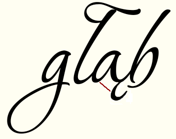
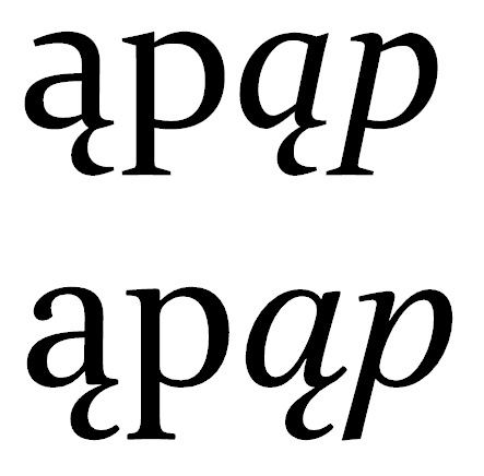
I've been working on one of my fonts— an update that will be available in OpenType. Recently, I completed a version of the same font for a client in Poland. She needed some of the Central European characters. After doing the work, she requested that I revise the l-slash (unicode 0142) because she said it looked too much like a lowercase T. She asked that the slash be placed high on the character, so I gave her what you see here, and she loved it.
I personally think it looks wrong, but I'm not sure how to go about resolving the look before I release it for OpenType. I was thinking of placing the slash low on the glyph, but I'm not sure if that's the right way to go either. Any suggestions?
Thanks