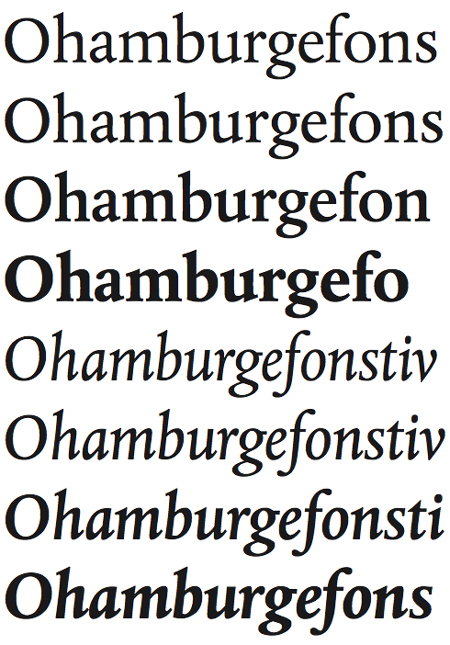
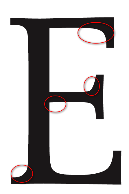
Both releases are considered as definitive versions and at first sight the DTL Albertina and the MT Albertina seem to be identical to each other. But on closer inspection slight differences reveal themselves to the beholder (e.g. how the serifs flow out of the stems or how the curves are drawn).
I’ve drawn a first comparison between some of the characters. I’ve chosen the characters “E”, “F”, “e” and “c”, because “E” and “F” as well as “e” and “c” have some common ground, so that one can review the consistency and the homogeneity of the design.
Compare for example the upper arm of the uppercase E and F: within the DTL design they are identical; within the MT design they differ from each other. Or compare the (inner) left-hand curves of the lowercase e and c: Again within the DTL design they look alike and within the MT design they differ. The DTL design treats the same in the same way, the MT design does not. Moreover, the DTL curves are firmer drawn. So, in my opinion—but I am only a layman—the DTL design is more consistent and homogeneous.
So, what do you think? Which version do you prefer?
| Attachment | Size |
|---|---|
| DTL_EF.png | 23.87 KB |
| MT_E.png | 36.66 KB |
| MT_F.png | 25.57 KB |
| DTL_e.png | 16.27 KB |
| DTL_c.png | 16.04 KB |
| MT_ec.png | 41.14 KB |