
These scans are from G magazine. The monoline script looks familiar, the roman reminds me a bit of Electra, but of course isn't.
Any ideas?
Thanks
Richard
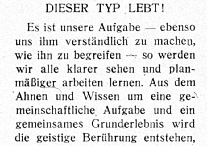
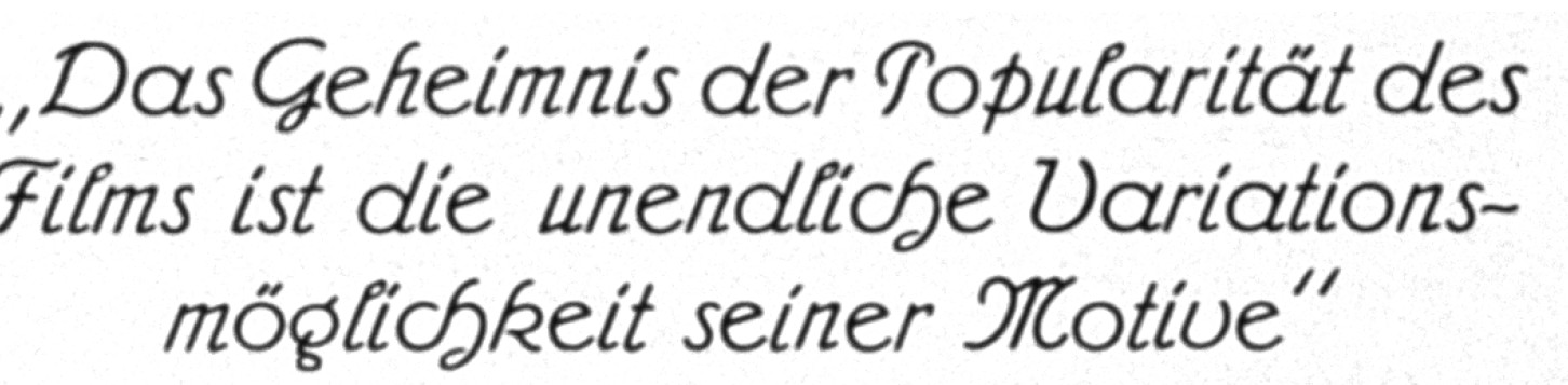
These scans are from G magazine. The monoline script looks familiar, the roman reminds me a bit of Electra, but of course isn't.
Any ideas?
Thanks
Richard

The script is Admiral, designed in 1906 by Julius Gipkens for Wilhelm Woellmer.

The serif looks somewhat similar to a typeface called De Vinne No. 11, however the G is quite different. Most of the lower case looks quite similar, although the weight of No. 11 is a bit too heavy and maybe slightly wider than this sample. I saw this in the Jaspert "Encyclopaedia of Type Faces".
McGrew shows DeVinne Roman done by Frederic Goudy at the end of the 19th century, and except for the G it also seems quite close (and even a better weight match) to this sample.
- Mike Yanega
Thanks for the help!
Captured from web.archive.org on 13 Oct 2013. view this capture