Hi all,
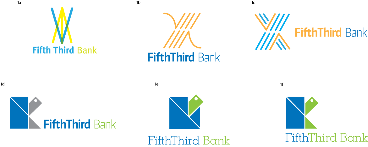
This is an assignment for my Brand Identity class in the Visual Communication program at SAIC. My brief was to re-brand Fifth Third Bank*, a regional bank in the American Midwest. The bank was started in Ohio and their current branding was just redone by Deskey, a brand consultancy firm that also does Pepto Bismol's packaging]] but I and my class feel that its missing the mark entirely.
The first few are variations on a wheat sheaf, representing the values of growth and security, and history. The others are variations on a turtle icon that also has suggestion of a 5 and 3. I chose a turtle because I think most bank logos are way too generic looking, especially the current 5/3 logo. There is also zero humor is most bank logos and I'd like to change that. Tortoises are some of the longest living animals on earth.
*Disclosure- I bank here and wish I didn't because their customer service quality has been less than average.