
this is a Type inspired by a group in Chile, that write on the walls, political and social topics...
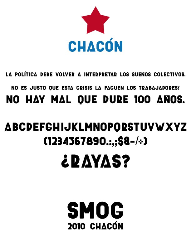
this is a Type inspired by a group in Chile, that write on the walls, political and social topics...

This is really fantastic. I particularly like the A, the R, and the Q.
The asymmetric curve on the D, R, 2 and 5 is great. Have you considered working that same curve into the tail on the 6, 9, the parentheses, and the ampersand? I think it would work in those characters.
It might be the small point size, but the top of the D doesn't look like it gets completely horizontal, unlike the R, 2, or 5.
The middle of the S is too horizontal... it should be diagonal.
I don't like the thin horizontals on the G and the J. The G could have an extra vertical going straight down in the lower right, or maybe just a square corner in the lower right. The J probably doesn't need a horizontal at all.
The W looks squished. Not sure how to fix that.
Overall I think it's great. It's got a stencil, constructivist feel while being refreshing and different.

Interesting take on the Ñ. I'm not so sure about the Í and Ó, though.
Captured from web.archive.org on 16 Apr 2015. view this capture