Typophile

Illiad Sans Redesign

Fábio Duarte Martins

Hello everyone!

I'm redesigning a old project, a type family sketched in 2008. I would love to read your feedback, as I'm hoping on some really good insights as I share the redesign process here.

So, here's the sketch:
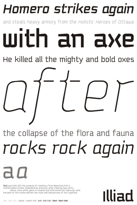
First two cents, anyone?

Thank you in advance. Cheers!

Dump the gaps.

hhp

hrant: the f and t gaps?

And the "x", and the "k"...

hhp

hrant: Any reason for it? I think it's one of the elements that give personality to the typeface.

This thing has tons of -nice- personality already.
To me the gaps give it a personality disorder. :-)

hhp

I agree with Hrant: those gaps are too effective fixation points for comfortable reading. Your other design features are more than enough to make your font stand out. Loose the gaps, and you have a very good headline font.

Tomi & Hrant: Ah, I got the point of it. Thank you both!

The light italic looks very cool! The w is looking very narrow and thick in the bottom. It appears to look a little different in "ottawa". The a leans a little left for me, which is not a problem in the middle of a word, but at the beginning feels odd. I agree with whats being said about the gaps.

james: I also love the italic, thanks!

The "w" incoherence is something I'm struggling right now. The light version is very curvy, while the black is very orthogonal, and the resulting weights are interpolations of these two.

As for the "a", your right. The top bar is too wide.

Cheers!

Captured from web.archive.org on 14 Apr 2015. view this capture