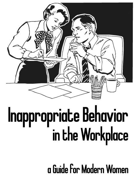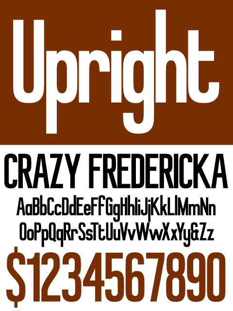
This is a typeface I've been working on for about a month. It is supposed to make anything set in it seem amusingly outdated, which would give infographics a touch of irony.
I would like some critique on this font. As you can tell from the name, this font should be tall and serious, but I would also like it to be a tiny bit goofy at the same time (I feel the G, f, t, and y bring this part out), and I think something is off in the proportions of the upper case.
| Attachment | Size |
|---|---|
| Upright Specimen.pdf | 85.24 KB |
| InappropriateBehavior.png | 46.59 KB |