
Any idea?
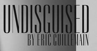
thanks!
Any idea?
thanks!

Empire
Empire is close, but not the one.
thanks Florian! I'm guessing this is a custom one then cause it doesn't seem to be completely solved-

The contrast on this N, for example, is backwards from all the contrasted sans I have been finding. However, it's just like the narrow serif fonts, like Keyboard. It's not exact (the G chin is too high, and the S spine is not the same), but it would be a better approximation of what appears to be a custom font, if you removed the serifs from such a font.
- Mike Yanega
Captured from web.archive.org on 15 Oct 2013. view this capture
