
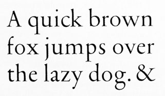
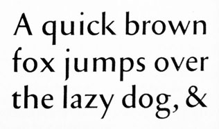
This is from Christopher Burke's excellent "Active Literature" - one of the best book on typography I own. In the final pages Burke shows some very interesting sketches by Tschichold of a sanserif version of Sabon, done around 1960. Burke wrote:
"Despite the dismissive things he wrote about sanserif in his later years, Tschichold seems never to have lost interest in this category of letterform: the first designs he made for his classic typeface Sabon also included a sanserif version, which was never produced. Here he tried to incorporate elements od old-face roman type into sanserif, in a different way than Eric Gill had done, and his sketches show that he anticipated some of the features that surfaced in sanserif types of the 1990s (and later)".
Burke's book is the only place where I have found references to a Sabon sans. A couple of more sketches show some different treatmens of the sans - the shape of the lowercase "a", for example.
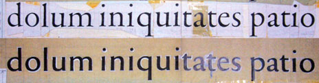
After reading Burke's passage, a question comes to mind: what are the contemporary sans that Tschichold anticipated? On another level, looking at the serif sketch, it is easy to see - for me at least - how the early drawnings of Sabon were much more related to the Garamond model than the official version released in late Sixties.





