
Hi all
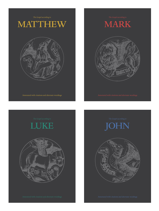
I'd like to get some feedback on these proposed cover designs for a set of the four gospels of Matthew, Mark, Luke, and John.
The format is 165x230mm, and the covers would be printed on an uncoated (maybe recycled) stock.
Thanks in advance
Hi all
I'd like to get some feedback on these proposed cover designs for a set of the four gospels of Matthew, Mark, Luke, and John.
The format is 165x230mm, and the covers would be printed on an uncoated (maybe recycled) stock.
Thanks in advance

The spacing in "MATTHEW" is messy... and hard to fix!
1) Modify the "T" by making it narrower, and ideally slanting the right serif in the same direction as the left one. These tricks will give you more room to tighten up the "TT".
2) Loosen the "HE", and maybe the rest a bit too.
hhp

Given the traditional typography, some would say that the all caps should be set much looser. That would make the spacing easier too.
Thanks both for the comments, I'm taking it all on board. Also interested in more general design feedback as well.
Thanks

I might do the colored text in a silver or metallic colored foil, very attractive and will bring the piece up a lot. You could also do the grey image in a silver spot metallic ink, or a spot UV on the grey background. Use the printing techniques available to really make this minimal design shine.
Captured from web.archive.org on 24 Jul 2014. view this capture