
Does anyone have a list of commonly colliding accents they'd be willing to share? I'm mainly looking for Latin 1,2,3,4.
Does anyone have a list of commonly colliding accents they'd be willing to share? I'm mainly looking for Latin 1,2,3,4.

On a related note, is it better to kern and prevent collisions or just let them occur? My impression is that accent collisions are rare occurrences, and because many fonts do not kern to prevent them, users would be more disturbed by a big gap than by a crash.

The type and frequency of accent collisions depends heavily on the language used. Native American languages have some orthographic practices that cause thorny problems in this area, like the use of multiple accented vowels in sequence, surprising letter combinations, or unusual sequences of diacritics. Consider examples like íì, íë, fì, ęj, fš, and fā which are not sequences that occur typically in European languages. How much of this should a font designer reasonably be expected to prepare for in advance? It is however not that much trouble to automatically generate a large pile of text with potentially problematic combinations and then eyeball for the worst ones.
On a related note, is it better to kern and prevent collisions or just let them occur?
Think of type as an artifact of Guttenberg's promotion of the printing press rather than the photocopier. On that model, it is better to design ligatures to solve crashing problems that would be avoided by the skilled scribe.
* * *
I don't know how much the font designer is responsible, esp. for Native American language combinations. To add to the list above, Kiowa uses macrons above and below vowels. The combination i+macronbelow, f, i+macron does occur. Of course, the editor wants the word in italic. "Crash" isn't strong enough to describe such a mess. I know this the usual way; I had to set it. The solution was to draw several f-ligatures to work with the various vowels. I'd say the designer can't anticipate all such occurrences; what they can do is to have a EULA that permits the compositor to go into the font and do the needed work.

@Typodermic: I would maybe start looking at some vietnamese text.

Charles: On that model, it is better to design ligatures to solve crashing problems that would be avoided by the skilled scribe.
Better yet, use contextual variants to dynamically create ligated or otherwise adjusted glyph sequences that resolve collision problems. This is more flexible than creating actual ligature glyphs, and enables you to hit a wider range of potentially problematic sequences with a smaller number of glyphs.
Better yet, use contextual variants to dynamically create ligated or otherwise adjusted glyph sequences that resolve collision problems.
That is what I did in the case above. As you say, a slightly fewer numbers of glyphs to create. For the Kiowa, I used several variant f's rather than ligatures. As I remember, there one "f" for use with an i+macronbelow before, one for an i+macron after, one for any other vowel with macron or grave after, one for the i+macronbelow with a vowel+macron or grave after, and a final one for the specific sequence mentioned above.
Whether to use liga or calt depends on what is involved, and the solution. There are a number of European languages where an f followed by certain accented vowel are problems. Depending on the font, sometimes I make up a ligature, sometimes switch to a different f via a calt feature. Sometimes I use both, a ligature for the i and only a different f for other vowels.
YMMV, but my point is that much of this is only possible by the compositor, who has a manuscript in from of him/her. To anticipate all problems just isn't possible -- I believe even Ross Mills wonderful new font doesn't cover Kiowa.
@riccard0 I'm mainly looking for Latin 1,2,3,4 and focusing on Albanian, Catalan, Croatian, Czech, Danish, Dutch, Esperanto, Estonian, Finnish, French, German, Hungarian, Icelandic, Irish, Italian, Latvian, Lithuanian, Norwegian, Polish, Portuguese, Slovak, Spanish, Swedish, Turkish & Welsh. I'll research these myself. It's difficult because no search engines partial word searches. I can search for Tì and it shows me the Vietnamese word Tì but no words in other languages containing Tì. So I need to find word lists for all these languages, throw it all together in a big text file and search.
I put together a 6MB text file containing newspapers and Wikipedia articles from European languages and a few others I had listed above. I also Googled each pair just to see what came up. I assumed FPKTVWYft are the only letters at risk for accent collision. Lowercase t is an unlikely risk but I've made some strange lowercase tees before. In small cap fonts you might want to check more A accent pairs.
I don't think any capital accents are collision risks.
ći éî fā fă fã fè fë fē fì fî îè ît íč íň íř íš íž ši šī št tă tã úř žī Fā Fă Fã Fè Fë Fē Fì Fî Kā Kī Kř Kū Pā Pă Pã Pè Pë Pē Pě Pì Pî Pï Pī Pň Př Pū Pž Tå Tā Tă Tã Tè Të Tē Tĕ Tě Tī Tř Tš Tū Tž Vā Vă Vã Vë Vē Vě Vî Vī Vš Vž Wå Wā Wè Yā Yã Yū
'à 'è 'ì 'ù á' é' í' ó' ő' ú' ű' ý' ń' ź'ã'ä'ë'î'ï'ñ'õ'ö'ü'ÿ'ā'ă'č'ē'ĕ'ě'ğ'ĩ'ī'ĭ'ĵ'ň'ŏ'ř'š'ũ'ū'ŭ'ž'
The whole point of this is to have a "at the very least, check these pairs" list. What to do about accent collisions is a different matter. I just want to have a reasonable, practical list that covers the majority of European languages which use Latin 1,2,3,4. If anyone knows of any important pairs I've missed, please let me know.

I don't know what criteria you are using, but få (Få) and På are very common words in Swedish and other Scandinavian languages, and the combinations Kå and Vå (as in Kål and Vår) also occur commonly. Are ä and ö not a concern? Because fä and fö are very common combinations in Swedish, and they also occur commonly after K, P, T, V...
I didn't think the ring would collide except maybe with the T. (I just noticed I left the Wå in there). But I didn't include rings for the same reason I left out the circumflex & dotaccent. But yeah, I see what you mean, they'd definitely be in danger of being pierced by a serif. I'll add them to the list.
Fä Få Fö få fä fö Kä Kå Kö Pä På Pö Wä Wö Vå Vä Vö
Cheers.
... and Tä Tö
Forgive me for getting off-topic with Native American languages. I don't know the European languages all that well, but don't forget the italic -- does f or j or p ever follow i+ogonek?
Etc. The general point is accent crash is something akin to kerning -- at some point, almost all pairs pop up.

Romanized Chinese
Tone marks are conveyed in Hànyǔ Pinyin using the following glyphs:
 ā ē ī ō ū ǖ

 á é í ó ú ǘ

 ǎ ě ǐ ǒ ǔ ǚ

 à è ì ò ù ǜ
The only letters from your collision list that could precede these are FPTWYft. Not all potential combinations exist in Pinyin, but I reckon most do.
Depending on the angle and width of your grave, in Italian there are also "Tè" and "fè", "fì" is rare but possible, while "fà" exists only in misspellings.
Be sure to check out Romanian, which has combinations like Ţâ (Ţânţar), Tâ (Tâmplare) and fâ (fâsă).
Most Romanized Chinese & Japanese pairs are not included
Maybe you could include Tō, as in Tōkyō.
German: Fö/fö, as in föhn.
French, but maybe we're going too far: ïf, as in naïf.

For Lithuanian you would need to allow for at least ą, į, ų plus j. Not all quality fonts deal with these successfully, e.g. Adobe Caslon:
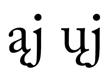

Adobe fonts, especially older ones, tend to be missing pairs that cannot be considered too exotic, even when a similar -and equally exotic- pair is present. For example IIRC Minion has "Yp" (like in Ypres) but not "Yq" (like in Yqem) which needs even more negative kerning.
hhp
Many indigenous languages in North America (particularly in the Athabaskan family) have quite exotic stacks of diacritics, and the ogonek is popular for indicating nasalized vowels.
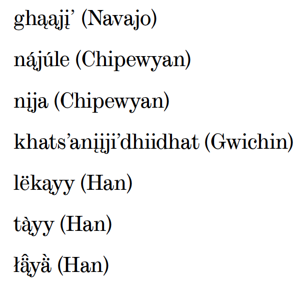

I don't mind the ogonek-jball "ligature".
Nonetheless, the aogonek is nasty in the Scotch Modern genre, the accent almost like a double-vision of the pothook serif.
Here's what I've got so far. I don't know if I should add all the circumflexes . . . I didn't think they'd be in as much collision danger. I guess it's useful to have a few in there to let me know that I need to design a better circumflex.
ąj ći éî fâ fā fă fã få fä fè fë fē fì fî fö îè ît íč íň íř íš íž ïf įj ši šī št tă tã úř ųj žī Fä Få Fā Fă Fã Fè Fë Fē Fì Fî Fö Kā Kä Kå Kī Kö Kř Kū Pä På Pā Pă Pã Pè Pë Pē Pě Pì Pî Pï Pī Pň Pö Př Pū Pž Ţâ Tâ Tä Tå Tā Tă Tã Tè Të Tē Tĕ Tě Tī Tö Tō Tř Tš Tū Tž Vå Vä Vā Vă Vã Vë Vē Vě Vî Vī Vö Vš Vž Wå Wä Wā Wè Wö Yā Yã Yū 'à 'è 'ì 'ù á' é' í' ó' ő' ú' ű' ý' ń' ź'ã'ä'ë'î'ï'ñ'õ'ö'ü'ÿ'ā'ă'č'ē'ĕ'ě'ğ'ĩ'ī'ĭ'ĵ'ň'ŏ'ř'š'ũ'ū'ŭ'ž'
Nick: Nonetheless, the aogonek is nasty in the Scotch Modern genre, the accent almost like a double-vision of the pothook serif.
My inclination would be to modify the exit stroke (‘pothook serif’) on the a when adding an ogonek.
> the aogonek is nasty in the Scotch Modern genre
There's no reason to slavishly perpetuate such bad design.
If the result is 1% less historically Scotch Modern but 100% better ahistorically (read: functionally) then it's almost certainly good design.
hhp
Are there common collision problems with ħđŁł?

Don't forget the Apostrophe followed by lowercase accented letters, specially if you're kerning stuff underneath it to start with (which I don't think is a great idea).
Also regarding the apostrophe in Minion Pro for example a collision occurs between the L and the e in words like, L'école. Just saying that kerning pairs are not an island, they have to look good in their surrounding as well.
Good point Johnny. Also, you need to check the accents with all trailing punctuation -- esp. acute, dieresis and macron accents followed by both single and double quotes, parenright, the question mark, maybe the exclamation point, and bracketright. With an i, all the accents except grave and the above punctuation. Leading punctuation s/b checked against the grave & all the accented i's.

[tracking]
I put the single straight quote in there because I use it as the master for all quote-like glyphs. Hmm question mark . . . true.
An early 21st century solution to the ogonek clash might be to use wider tracking throughout the text. I haven’t a clue how the early 20th century printers managed it, but most of what I’ve seen in Athabaskan texts is actually pretty good.
I agree that the Scotch Modern a-ogonek is a disaster. I’ve seen examples where the ogonek was hung in the middle, which is antithetical to Eastern European typography, but can be acceptable for Athabaskan uses given careful design. Of course there are other occasions where they used a cedilla instead...
Any font aiming to support the majority of European languages should also try to handle the Pinyin occurrences. The demand for such support will only be increasing with time, and seeing the good support for various European diacritics would lead most users to expect the Pinyin ones to work reasonably well too.
Any font ... should also try to handle the Pinyin occurrences. The demand for such support will only be increasing with time
Note that Hànyǔ Pinyin with proper tone marks appears almost exclusively in pedagogical contexts (in particular, Chinese language learning and Sinology). Even in China proper Pinyin orthography has no everyday use (bar education). However, this fact does not nullify your thesis; demand for such support will surely increase, and any conscientious type designer would brook no collisions involving Pinyin diacritics.
Omitting tones from romanized Chinese is not very different from leaving the accents off caps in French: a custom arising from the character-set limitations of typewriters (in the case of French) and 1-bit fonts. A great deal of sinological work still doesn't bother with tones, but it is reasonable to hope that usage will increase as the number of fonts with Unicode pīnyīn continues to grow (in 2008 Thomas Phinney reported they are included in Adobe Latin 4). Sinology may be coming around: for example, in 2008 the University of Chicago press included tones in Sigrid Schmalzer's The People's Peking Man -- where there is a noticeable difference in type color between pages with lots of pīnyīn versus those without.
> arising from the character-set limitations
I thought the main cause was limited vertical space (especially in metal typesetting).
hhp
Keyboard input limitations are also critical. One important reason you still usually find accents left off capital letters in French is that the French Azerty keyboard layout offers no way of inputting some key capital letters with accents like É and Ç other than alt+number short cuts.

I guess poor Aringacute would welcome the addition of the U-dieresis Hànyǔ Pinyin characters, at least then it's not the only one standing out so much anymore :)
> Keyboard input limitations are also critical.
Yes and no. If one feels the need it is not so hard to simplify typing by telling MS Word to auto-correct "Ha4nyu3 pi1nyi1n" to "Hànyǔ pīnyīn". And if one isn't sure of a particular character's tone MS Word's Phonetic Guide can produce its pīnyīn on the fly. The various u-dieresis with tones are a particular pain, of course, but where there's a will ...
David
You can use auto correction in MS Word to input accented capital letters, too. But people writing for email, internet forums, Facebook, or Twitter will not be using MS Word.
I can't be convinced that marking tones for romanized Chinese will ever spread beyond scholarly and technical publications, even with expanded font and input support. Will you see people spelling their own names with tones? Will road signs in China include tones for road names and place names? I just don't see this happening.
I think the important point is not whether the use of Pinyin will become extensive and common or not. (I agree with you that its distribution is likely to be limited, though perhaps surprisingly large.) Learners can be expected to be somewhat familiar with Pinyin, and will occasionally encounter a situation where they may feel its use is important. In those situations, font designers are obligated to at least think about the results of Pinyin diacritic combinations, whether they bother to support them or not.
Font designers do not generally make fonts for use in random, one-off situations, at least not when designing fonts for commercial use. A good font is instead designed to be functional and convenient for the largest variety of possibilities within the designer’s capabilities and the design’s restrictions. This is a hard idea to characterize precisely of course, but it is intuitively easy to grasp: make your work fit as many possible circumstances and uses as is within your means to support.
My point is that if a font designer bothers to include the various European diacritics in a font, then they should consider the uses that an imaginative user might subject the font to. Deciding whether to support these uses is of course a separate decision, but a reasonable designer should at the very least ponder the possibilities. The large and increasing number of Mandarin Chinese learners – and occasionally native speakers – who have some interest in Pinyin behooves font designers to at least consider the possibilities inherent. Of course it’s still up to the individual designer whether they bother to invest the effort or not.

I'm not seeing Tê (Tête-à-tête) and Fê (Fête) in your latest list. Might not cause a problem though. Also; in Dutch the j can get an accent accute together with a predecessing i (as they are seen as a single character), which can lead to problems with a following questionmark or quotationmarks, although the 'j accent acute' is not in Unicode (I believe).

/track
It seems to me that carons are in little danger of collision due to their shape. They don't seem to be in much more collision danger than a dot accent. In fonts that I tested where some other accents collide, the carons all seem to clear. I think if you have a situation where carons are colliding it probably means you need to check every possible accent combination, including dot accents. Hmm?
I have spent a bit of time today doing kerning for underscores as I want my Ligature descriptions to look good.
Came across a problem with a lowercase j so had to raise the underscore to sit on the baseline.
Something else to consider...

.

I extended Typodermic’s latest list by a few more pairs, some of them mentioned in this thread.
The string is: ąj ąg ąy ći éî fâ fā fă fã få fä fè fë fē fì fî fj fö fü fð gj gy îè ît íč íň íř íš íž ïf įj įg įy ši šī št ſä ſö ſü ſÿ tă tã úř ųj ųg ųy žī Fä Få Fā Fă Fã Fè Fë Fê Fē Fì Fî Fö Kā Kä Kå Kī Kö Kř Kū Pä På Pā Pă Pã Pè Pë Pē Pě Pì Pî Pï Pī Pň Pö Př Pū Pž Ţâ Tâ Tä Tå Tā Tă Tã Tè Tê Të Tē Tĕ Tě Tī Tö Tō Tř Tš Tū Tž Vå Vä Vā Vă Vã Vë Vē Vě Vî Vī Vö Vš Vž Wå Wä Wā Wè Wö Yā Yã Yū ¶ Cyrillic: її ії
The highlighted ones are my additions:
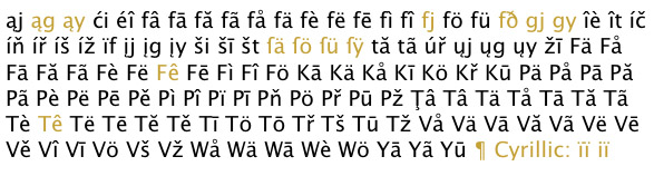
On basis of this list I did a quick testing with two of the rare fonts which include all of these characters:
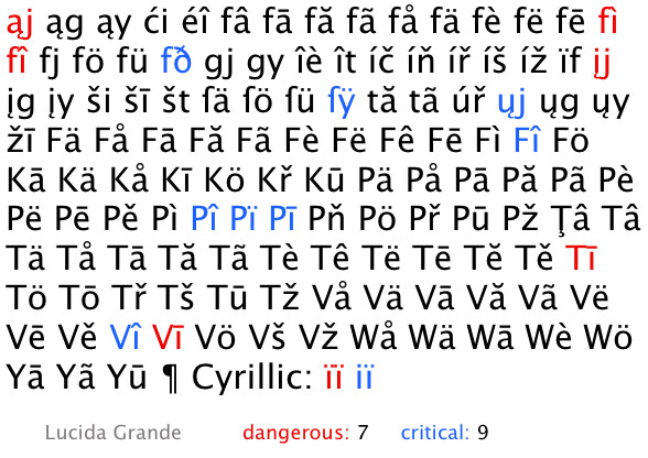
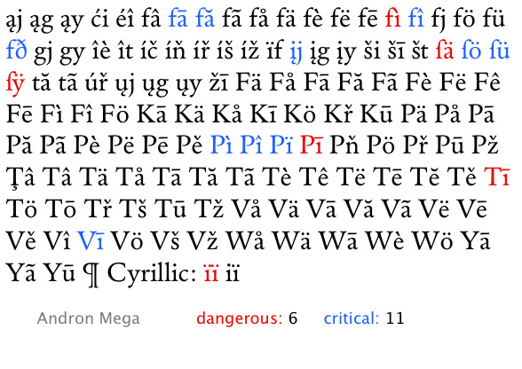
More font testings with this yet-to-be-extended character string might be interesting.

.
"fð occurs in Icelandic(?)"
Yes. The word «leyfð» occurs in the Icelandic translation of the Universal Declaration of Human Rights (and is also found elsewhere, Google has 107,000 hits).
The sequence fj also occurs in English, where the word fjord is borrowed from Norwegian. It’s common in some contexts, like nature writing and glaciology. Although fiord is preferred in much of the Commonwealth, fjord is usual in the US and to a lesser extent in Canada.
Captured from web.archive.org on 20 Oct 2013. view this capture