The mission of Center for Advanced Design Research and Evaluation (CADRE) is to develop and execute relevant original research in the areas of architectural and engineering design solutions having an impact on: end users, including occupant well-being and user effectiveness; operational performance; and sustainability of the built environment. Dissemination of this new knowledge to end users and the design community is inherent in our organizational intent.
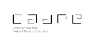
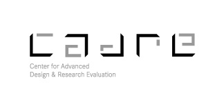
After much discussion we decided the logo needed to be bold, technological, and organized. It could represent in an abstract fashion the ideas of dissemination, the center point for emerging ideas, a surveyors benchmark, form which new directions are established and buildings built.
Also, it is important to establish Cadre as a word and not just an acronym. Cadre vs C.A.D.R.E.
My concept originated from abstracted arrows that pointed to new directions, all emanating form the word Cadre.
Color has not been applied yet. There is no budget for this. I am working on this probono through my firm.
I would love to hear some thoughts from any one out there. Does it read? Should it be less legible? more? any comments.
Thanks,
C L Jones