
Over at Brand New/Underconsideration.com, Armin Vit presents Towers Watson’s new visual identity, made by Interbrand. One of the key design elements is ‘Clarity, a proprietary handwritten font’.
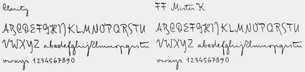
Only problem: this is a customized (?) and illicitly renamed version of Julia Sysmäläinen’s FF Mister K. In the comments, Erik Spiekermann recounts what happened:
”Interbrand asked Ascender to change a few things in the font, to which the licensor, FSI, had agreed. Under the usual conditions that the name would not be changed. Ascender delivered a font to Interbrand that was called MrK_TW, acknowledging Julia Sysmäläinen’s original work. Somehow (?) the name got changed to ‘Clarity, a proprietary font’. With this, Interbrand took full credit for the design work and probably charged the client for designing an exclusive typeface. As it happens, TW hasn’t even got a license for the font. […] As it stands, this is another case of a large design agency either being ignorant (which is bad), arrogant (which is normal), or stupid (which is very bad). In any case, they're stealing intellectual property, either on purpose or out of negligence. This has happened before (anybody remember where UPS got their ‘exclusive’ typeface from?) and will happen again, because while designers will complain about being ripped off themselves, they seem to be more lenient with other peoples’ property. […]”
I’m curious what action FSI will take.


