Typophile

App to simulate color blindness

Dan Gayle

Just found this, and thought I'd share it with everyone:

As designers, we sometimes forget that not everyone can see color the same way we do. I found a sweet app that allows you to simulate what color blindness does to your designs, whether it be interface design or the composition of a 4-color poster.

Here's an example of this page as viewed by someone with color blindness:
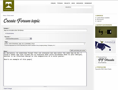
So this free app for Windows, Linux and Mac simulates how approximately 5% of all men will see your designs. It's a pretty cool app to add to your toolbox o' design stuff.

Anyway, the app is here http://colororacle.cartography.ch/

I am colour blind (deuteronopia), and it is eerie how I cannot notice anything out of the ordinary with the colours in the sample above. Only because the elements like the Font Bureau advert are on the same page enabling side-by-side comparison do I see that the colours are actually different. When people with normal colour vision see the above sample and immediately notice that the colours are off?

Wow. Totally. The colors in that screenshot are totally opposite of the live website.

As someone who is already colorblind, I wish there were a software that did the reverse and let me see the way normal people do :)

One day there will be hardware to do that!

hhp

Captured from web.archive.org on 14 Jul 2014. view this capture