Typophile

Font Aid IV: Ampersand Entries

This thread ran to 4 pages of replies and only 2 were recovered, so replies are missing.

francis bold0 votes

For those who have contributed to the Font Aid IV Project, I thought it would be cool to get a cheeky preview of what you lovely people submitted.

Its not necessarily a crit, just a place to see what different styles and variations you come up with. Feel free to comment how you wish tho.

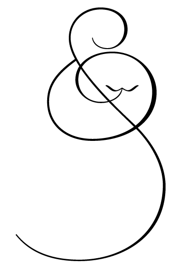
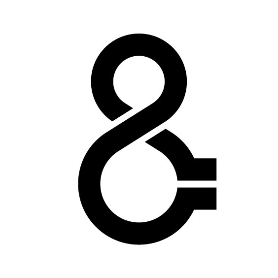
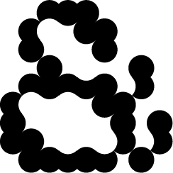
I went for a simple, circley, wiggly, snowman style :)

And off course what a great thing the Font Aid team are doing to raise money for this tragedy. Good to know there's so many caring people out there.

---
Joe

I submitted this one today:


Here's mine, modified from my http://Ambicase project.

I fontstructed something:

Want this one? Just take it...

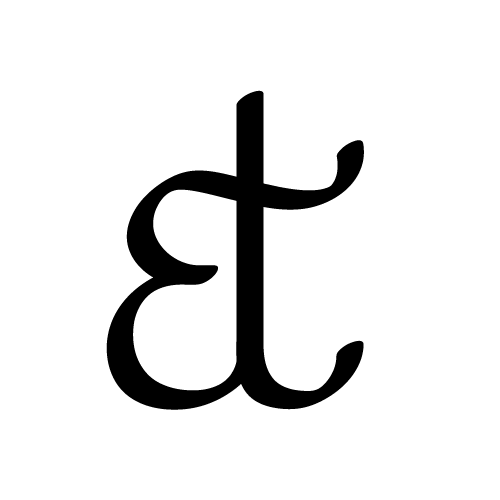
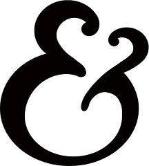
But it is a bit calligraphic

Michael

I submitted two:

elaborated upon from one I'm working on.

That's beautiful Michael. Email it in!

To whom Craig... I haven't been paying attention lately.

Michael

Michael — The info about the project is here:

Font Aid IV: A Call to Action
http://typophile.com/node/66544

You'll need to provide the artwork in vector format.

Here’s a little something quite ordinary and mundane from me.

Here is my contribution, a single character.

Loads of different styles here and all very cool!

According to Miss Tiffany; the last Font Aid appeal (Font Aid III) for raising funds to expedite relief efforts in countries affected by the Indian Ocean earthquake and tsunamis, gathered more than 220 designers world wide who participated.

It would be great if we could far exceed that on this appeal and hopefully raise even more money. so spread the word!

---
joe

I just sent in mine. Here it is:

It's based on a doodle I did back in the seventies. Never new what to do with it until now. Let's see lots more.
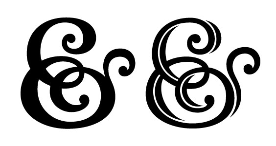

I just submitted this – based on a doodle I did this morning.

Here are 2 that I submitted a few days ago:

Also, here is a link to a poster I made from one of then on my Flickr page:

http://www.flickr.com/photos/dezcom/4299209642/

Here's something I'm thinking of submitting after I clean up the curves:

is that ok?

I like it, David!

It's great to see so much excitement around this. We've had close to 50 submissions so far and they have come from all over the world. I can't wait to see the final results. Thanks everyone!

@Jongseong: There's something vaguely Sneetchy about yours!

@Nina:

!

I'll be submtting this tonight, as seen in it's full form here: http://bit.ly/6saoO1

Aw, this is lovely to see!

I wouldn't have imagined Font Aid would still be around now when I started it over ten years ago (!), but I'm glad it is and that Stuart and others have kept it going after I was in charge. I was thinking about it after the earthquake, and I'm glad to see the ball is already rolling. I'm definitely going to submit a design.

I just submitted this one...

My submission... I liked the irony of ampersand as decorative drop cap.

This is how my contribution looks like.

Me 2

This is what I did (not colorized)

~~~~~~~~~~~~~~~~~

<em>from the Fontry</em>

my last ampersand submission

Here's my submission, sent it in earlier today. :)

Glad I didn't scroll through all of those before making my modest little ampersand; I would've been too intimidated.

Good project, here's my submission.

Here is mine. Submited yesterday (in B&W, of course).

Here we go then:

Great project. Mine is a bit grotesque. :)

&...

Nice work everyone! Over 100 designers from 18 countries have contributed so far. Keep the submissions coming! The deadline is still scheduled for Friday.

Michelle

Another idea I had today:

Jongseong, that's an eagle!

hhp

Ah, damn, I didn't notice this earlier. Perhaps I can still make a nice ampersand before the 29th.

andrijko: Oooooh purdy!

So I have a Sneetch and an eagle. Interesting. :)

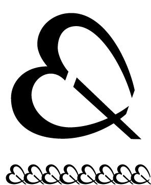
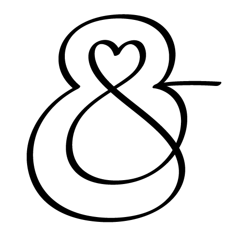
I noticed there is a heart theme for some of the relief efforts so this ampersand ties into that. I thought it works better as a linking border than an actual ampersand, so this may or may not be the final version.

Here's mine

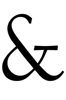
I know he would have contributed, so I am also submitting the Ampersand from an unreleased font By Jim Rimmer. The font was going to be called "Dubloon" for an edition of Treasure Island that Jim was planning. The font will eventually be release and titled "Rimmer" with proceeds going to a worthy cause.

Here's mine I just submitted based on a quick sketch tonight:

--
Claire

^^^ so thoughtful. (those ^s refer to two posts up)

Your first one is a beauty, Mr Kegler!

Howdy everyone, here's my shady roman ampersand. I enjoyed designing this for the Font Aid cause!

Some off these script ones are really nice. had ago at one myself but don't think it works as well.

@mightymoss, very royal mint. like it

...

Just a doodle study for a series of ampersand posters
planned for spring.

All proceeds to help Haiti.

That one is truly lovely, Alexander!

Michaelcina and Randy,

Those are SWEET!!!

*First time posting on Typophile*

It's cool to see such a strong response to a great little project.

What do you think?

Thank you! Thank you! Thank you! We're well over 150 participants. I've been trying to keep of list of the countries we've received submissions from. I could be missing a couple, but here are the ones I know for sure:

USA
Germany
England
Finland
Brazil
Argentina
Mexico
Canada
Japan
Austria
France
The Netherlands
Venezuela
Italy
Scotland
Switzerland
Portugal
Croatia
Slovenia
Ukraine
Peru
Australia
Sweden
India
Vietnam
Siberia
Latvia
New Zealand
Argentina

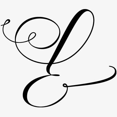
My calligraphic submission:

Phew, that's less easy than it looks like, here are some of my medicated curves:

CurveDoctor: very nice.
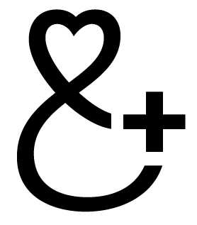
Maybe make one of the hearts a cross?

hhp

My humble submission:

Thanks hrant, you mean like a plus sign? Sorry I can't handle straight lines very well. Here is a more calligraphic try, indulging in my curve obsession:

hrant, you really give me a headache,

integrating straight lines into luscious curves, it seems impossible

My inverted &

Here’s a little bit of organic, grid based love.

It's my first post on Typophile, so hello everyone :)

Here is one of my submissions:

more: http://www.flickr.com/photos/patty_z/

One more I just finished:

I see what you did there.

Howdy Folks - my submission for the Project.

Here's mine:

One of my last submission

That Haiti HAARP ampersand is probably the first instance of a conspiracy theory-based ampersand

Greetings all, here's one from frozen MPLS.

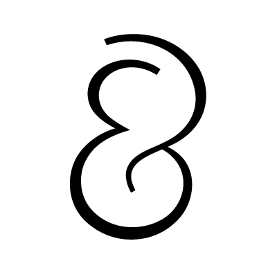
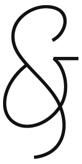
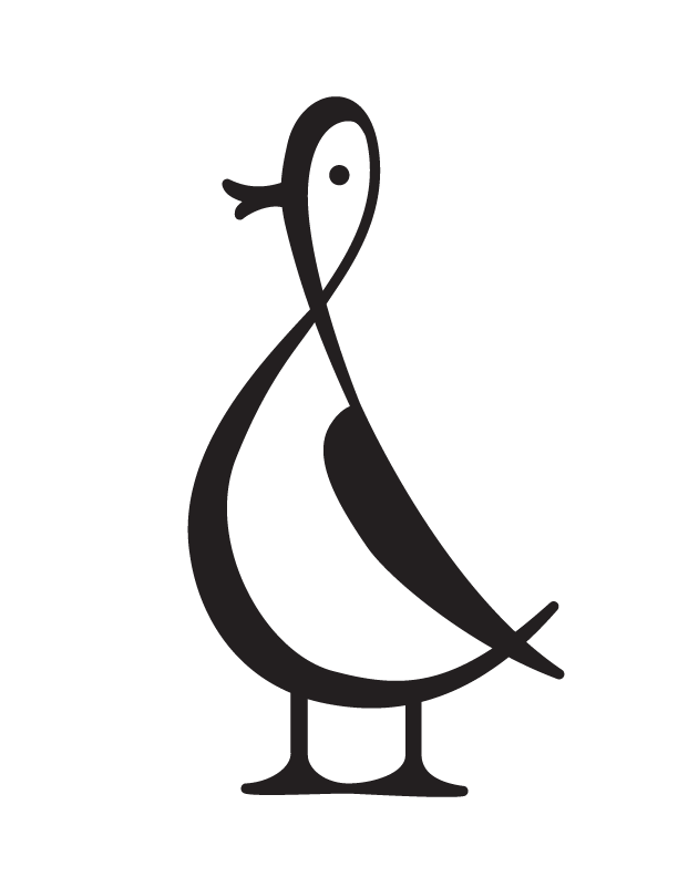
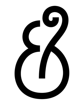
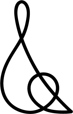
Here's my wife Joanna's continuous one line ampersand.

Dezcom, that is an pretty unique addition, but the internet-voice inside my head wants to say something witty and inappropriate about safety-belts & segregation... It may be a bit much?

To send or not to send. That is the question.

My second one:

Captured from web.archive.org on 11 Sep 2019. view this capture