Greetings,
Would really appreciate your sage advice and tyopgraphical wisdom.
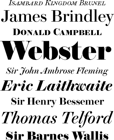
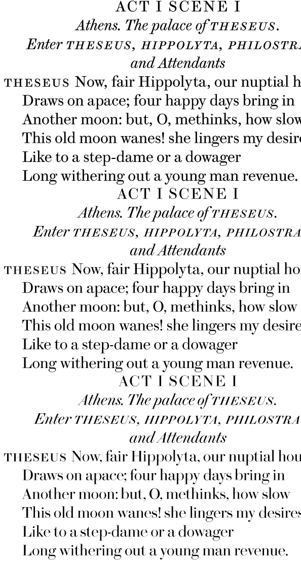
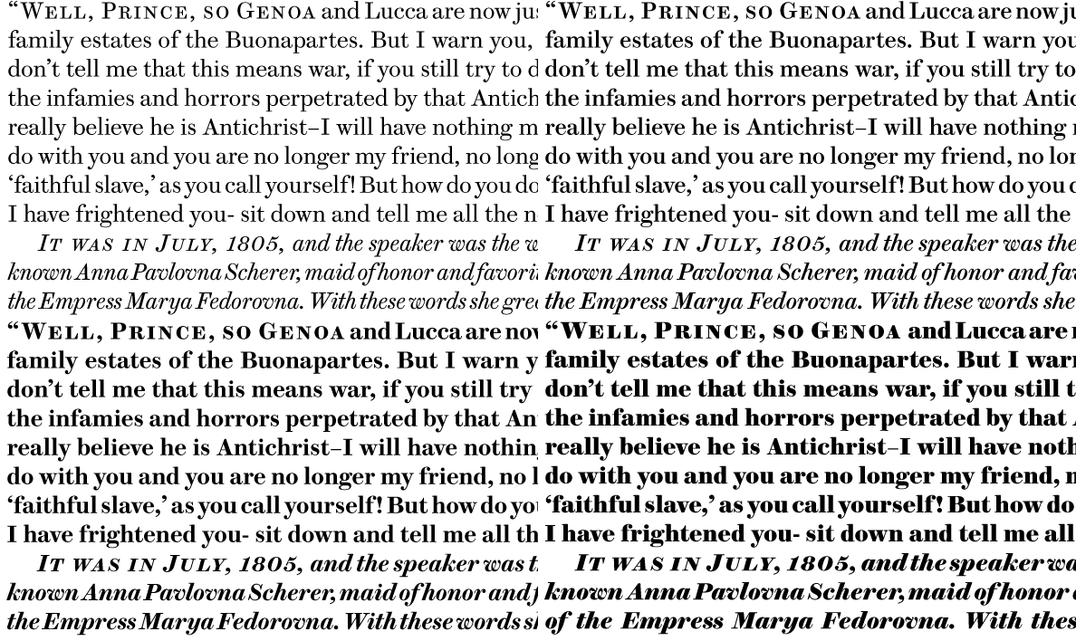
Working on a magazine redesign using Christian Schwartz' delicious Brunel (see samples below), which he describes as an anthology of the late eighteenth and nineteenth century English foundries.
I need to find the perfect sans to pair ... something that evokes the same era and feels like part of the family with that lovely period flavor. I'd also like to find a compatible slab ... so basically the whole works.
What would YOU match up? And if you have the time ... please tell me why.
Many, many thanks!
Brunel: