
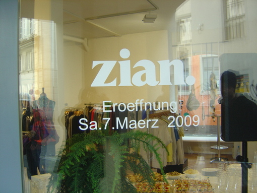
any idea what this may be? from a shop in lucerne, switzerland.
any idea what this may be? from a shop in lucerne, switzerland.

Seems similar to Trooper Roman. One digital version of it I know is called Talon, by FontBank. The 'a' counter seems rounder in your sample, but otherwise it's the closest match I have found so far.
- Mike Yanega
There are more weights for this style in Toledo by TypeShop (a.k.a. QBF). It's just close, but maybe close enough?
- Mike Yanega

It looks similar but its definitly different. For example the n has just one serif stroke at the right bottom.
The typeface looks very nice by the way.
thanks mike, but as noel (& you yourself) wrote, it definitely is not trooper roman. anybody else maybe? it would be awesome to know what this is.

To me it looks like an extra bold weight of Perpetua. There were some pre-digital variations like this back in the seventies, but the official source (Monotype) doesn't seem to have such a weight in their range.

Other similar fonts are Lapidary 333 Black and Capitolium, although Capitolium doesn't look like it too much.

Lapidary 333 is Bitstream’s name of Perpetua.
perpetua extra bold could actually fit very well, thanks mark!
would anyone have the specimen (or just any print of it from the 70ies) of such a weight in his library? i'm very interested in it and would love to have a closer look at other letters – a scan would be just great.
Here's one version from a specimen book from around 1980:

By the "LI" in the font number, I would guess that the source of this design may have been Lettering Inc.
The curve on the bowl of the "a" and other details are different, but the weight is similar.
thank you so much!
Captured from web.archive.org on 13 Apr 2015. view this capture