
Hi
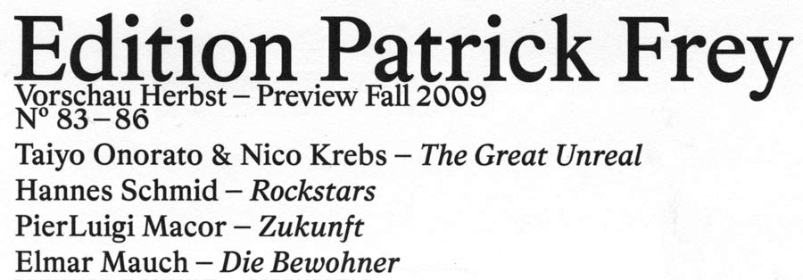
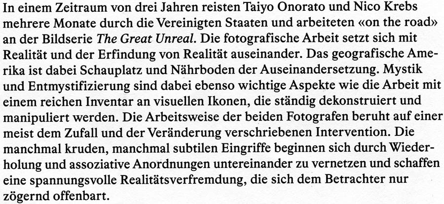
I found this nice typeface in a swiss publishing house brochure and couldn't ID it. To me it looks kinda dutch, but thats just a guess.
Any help welcome
Hi
I found this nice typeface in a swiss publishing house brochure and couldn't ID it. To me it looks kinda dutch, but thats just a guess.
Any help welcome

Dang, I know this one! The left-leaning 6 and 0 … so familiar. Just can’t put my finger on it.
I couldn’t find it in Mike’s serif ID Guide.

Well, I had great hopes for finding it in the Serif Font ID Guide, but no luck. This must not be one that I have catalogued, so I am really hoping you remember what it is Florian.
- Mike Yanega

I’m not very sure, but I think this typeface is called Bradford. It’s certainly custom, presumably made by Elektrosmog.
I couldn't find anything on their confusing site that made any reference to doing typeface design.
- Mike Yanega

This has a strong whiff of Plantin. You might enjoy Galaxie Copernicus from Village, a reworking of Plantin.
Mike, confusing the site may be – but they certainly have designed a few fonts so far.
I'm confused. Your link above is for Lineto, and I know they design fonts, but your previous link above that was for Elektrosmog, and that didn't seem to show any fonts. Was that the wrong link?
- Mike Yanega

both links are correct. eleketrosmog may have designed the typeface - they certainly designed the catalogue -> work/edition patrick frey/ on their site.
lineto is a foundry that releases typefaces made by the founders + friends of them, so elektrosmog (like norm and others swiss studios and designers) have released typefaces through lineto.
Mike, I’m sorry, but lineto too isn’t the best arranged site ever. However, if you need further proof that Elektrosmog actually do typefaces: Some of them have even been talked about here:
http://typophile.com/node/41355
http://typophile.com/node/17567
http://typophile.com/node/60713
Anyway, if the riddle can’t be solved, I might well ask the people at Patrick Frey themselves – they sit just around the corner.
The name of the typfaces is Bradford. If you download the Patrick Frey pdf here www.swips.ch/downloads/Vorschauen/patrick_frey_09.pdf
and open it in acrobat it tells you that the name of the fonts embedded. Also its nice if you want to get a closer look at the typeface.
To me it neither looks very alike Palantin or Galaxie Copernicus. But it feels a bit like dtl Fleischman, with its very smooth outlines (if you take a look at the vectors in the pdf you can see that most corners ar rounded) which gives the typfeace a nice soft texture.
Since I haven't been able to find any information about it on the net, I also guess that its an unreleased typeface. I personaly doubt that it is designed by Elektrosmog, since it has a rather different look from the typefaces they usualy make.
I think it looks more like a revival of a baroque typface which is based on prints, so the lettershapes are smoother and rounder. But thats just a guess.
Anyway thanks for your help, as always typophile members have been very supporting

Well, I think te credits should go to Beauclair as he/she mentioned the name of the typeface first. (4th post)
Alright, now I know why it looked familiar: the catalogue Noël has linked to is in my magazine rack. Cute Depeche Mode photo, isn’t it? ;-)
Thank you, Beauclair!
You’re welcome!
Beauclair (still happily male)
Florian wrote: »Cute Depeche Mode photo, isn’t it? ;-)«
Yepp, and I like Bon Scott’s Picture, too. Amazing.
It is indeed an amazing book, well worth the price.
I am adding a description of Bradford to the Serif Font ID Guide (assuming I can see all key letters to code it properly). Is Lineto the source for the font, even though it is not available for sale to the general public (yet)? Any idea about the year of design, or names of actual designer(s)? I tried Googling it and was not able to locate anything that mentions the font.
Thanks Beaclair for pinning it down.
- Mike Yanega
Captured from web.archive.org on 25 Jan 2010. view this capture